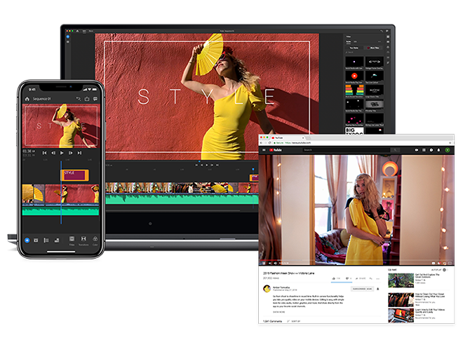
Adobe has a range of very powerful, and very complex high-end creative apps. Increasingly, it's making more accessible options. This is Adobe Rush, a light video editor that comes with a fairly steep monthly fee.
Adobe makes a range of great, industry-leading creative tools including household names like Photoshop. Increasingly, the firm is branching out into more accessible apps, including the powerful, yet simple painting app Adobe Fresco we took a look at last week.
We use Adobe Premier a lot at Windows Central to make videos for our YouTube content, but it can take a seriously long time to learn all the ins-and-outs of its features. If you just want to make a quick clip video or a fun vid for social media, loading Premier can be a bit overkill. Adobe built Rush (also known as Premier Rush) to make video production a little quicker. Is it worth the $10 per month asking price, though?
Easy to use in a rush
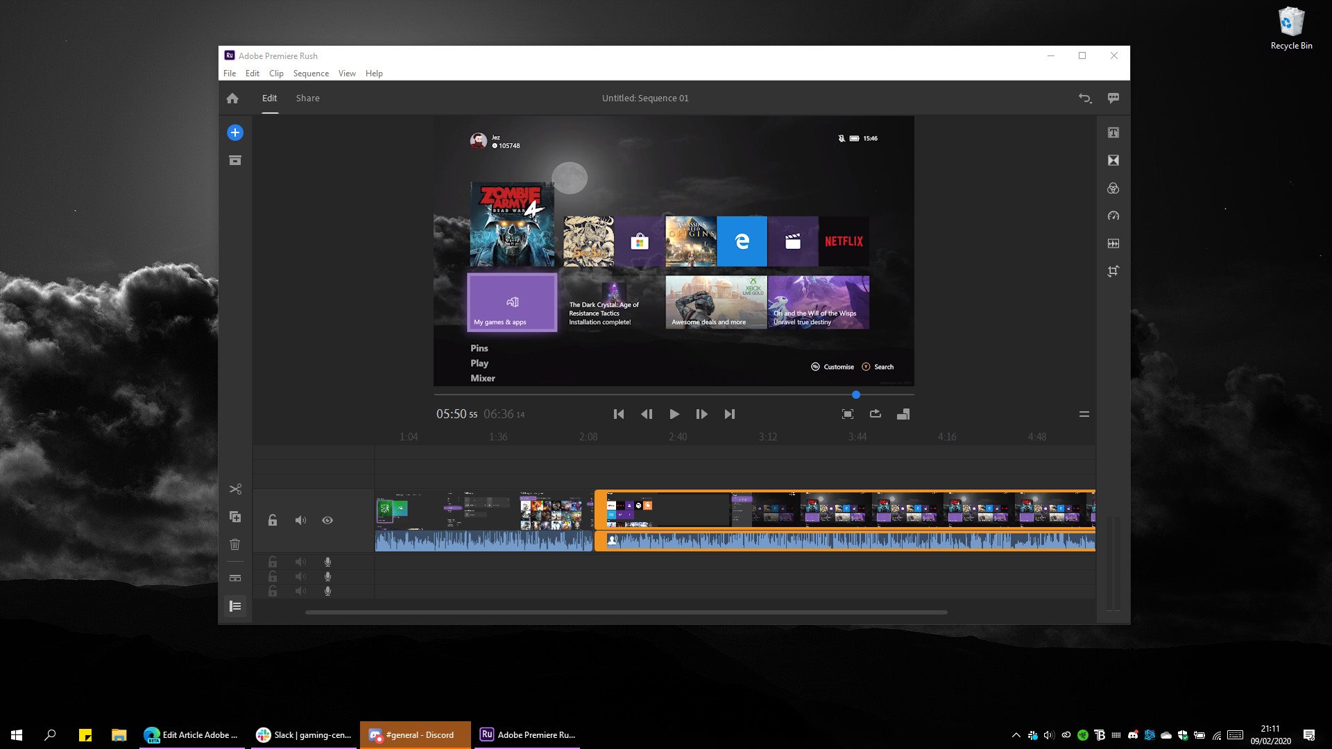
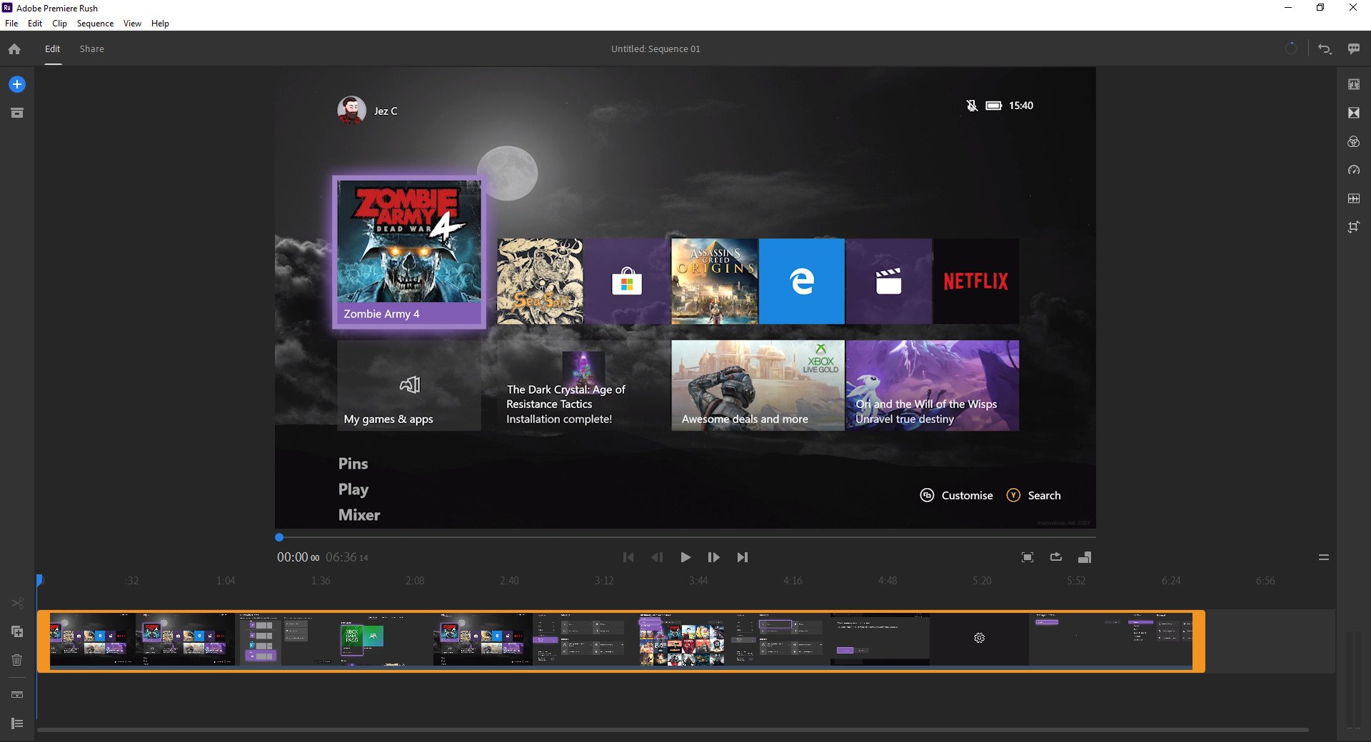
Adobe Rush has a familiar interface if you've ever used a basic video editor, complete with a timeline view with sidebars. Mousing over any of the tools or functions gives you a handy pop-up window that tells you what they do, and what shortcuts you can use, which is a nice touch.
Once you've opened the video you want to edit, moving clips around, expanding the timeline to add additional layers, or snipping clips in half to add transitions or remove content.
Although the first time I used Adobe Rush a while ago, it lacked some basic features like slow motion and audio editing, but it has been updated consistently over the past year which is encouraging. Selecting a clip gives you access to a range of editing features with quick tools that live up to the "Rush" name.
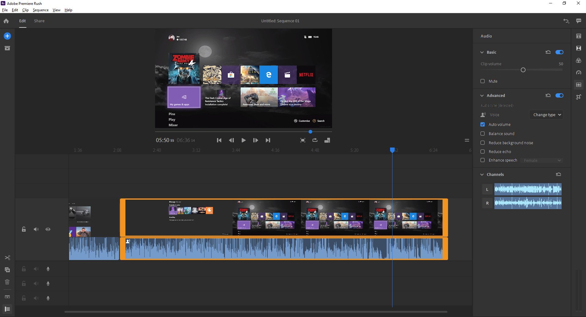
It gives you options to instantly edit out background noise from sound clips for example, or adjust the ramp-up speed on slow-motion clips. It's convenient, given that some of these sorts of editing features are quite cumbersome to adjust easily on the full-blown Premier app.
It's also great how lightweight the app is, even when dealing with 4K footage. It's simple to lower the preview resolution via the options, and my laptop fans didn't kick in once while using the app. It also syncs across devices if you want to set up a template for making social media hits off your iOS or Android device, for example, which is a nice addition if you plan to use it frequently.
Speaking of social media, Rush comes with an array of stock titles and animations to get you moving. The above clip took me about 5 minutes to make, using tweaked Adobe Rush stock titles and a gif to show to give a sound-on notification in the top corner.
Adobe Rush gets the job done if you're in a rush (hehehe), but there are plenty of downsides that I hope get addressed in the future.
A few minor annoyances
For all of its simplicity, Adobe Rush sometimes isn't the most intuitive interface I've ever used. There are no right-click options whatsoever. I suppose this is partially to keep the app in-line with its mobile and tablet versions, but on a Windows PC, not being able to get quick access to features via right-click feels a bit odd.
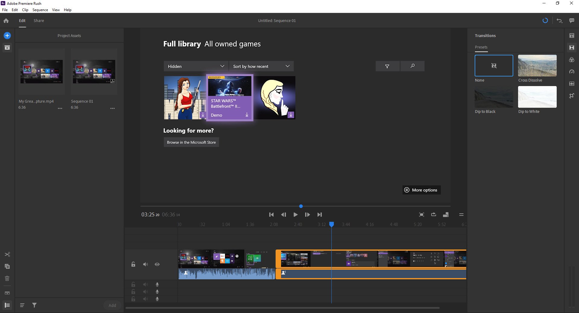
The file picker is also a little strange, with filters and sorting options hidden in the corner. Again, this is probably a throwback to its mobile versions, and evidence that the PC version could probably use a bit of UX optimization to make it more intuitive to meet PC user expectations. It also lacks many of the CTRL shortcuts that I've come to learn from Adobe Premier, which seems like an oversight.
The Dell "Ori" concept offers a glimpse at the folding future of Windows.
— Windows Central (@windowscentral) January 10, 2020
That crunch tho... 👀🔊 @Daniel_Rubino 😐 pic.twitter.com/nXks6OgF2b
I made this simple clip for our social media feeds with Adobe Rush for Android in about 5 minutes.
Additionally, there isn't a huge amount of content available for titles — specifically transitions. Adobe Premiere has tons of transitions between clips that can be tweaked easily. It feels like Rush is a bit anemic in this area.
Finally, Rush is competing with similar products like InShot on mobile, which offer far more features at far lower prices. InShot has a transparent gif and sticker browser which is great for making social videos on Instagram, as well as the ability to add animations to clips and images. Rush lacks these kinds of "cool" features, which could see it left behind in a rapidly evolving social media landscape.
Great, but pricey
Adobe Rush is a solid light video editing app with some great features for making quick clips and social media hits. It lacks a bit of the "cool" factor that some other mobile editing programs like InShot has, but makes up for it with a PC version that comes with cloud synchronicity between devices. It is, however, very expensive. The free trial version of the app gives you three exports, after which it asks for a monthly fee.
Adobe is a huge company that makes very expensive software, given that it is considered the standard-bearer in various types of industries. However, I'm not sure who would consider $10 a month for Adobe Rush to be worthwhile for making quick clips, especially since the free Microsoft Photos app does the basic stuff Rush does, and mobile apps like InShot offer more for a lower price. It's a shame, because Rush is otherwise, pretty great. I'm just not sure who it's for at this price.
If you want to give it a shot, in any case, rush over to Adobe right here.
