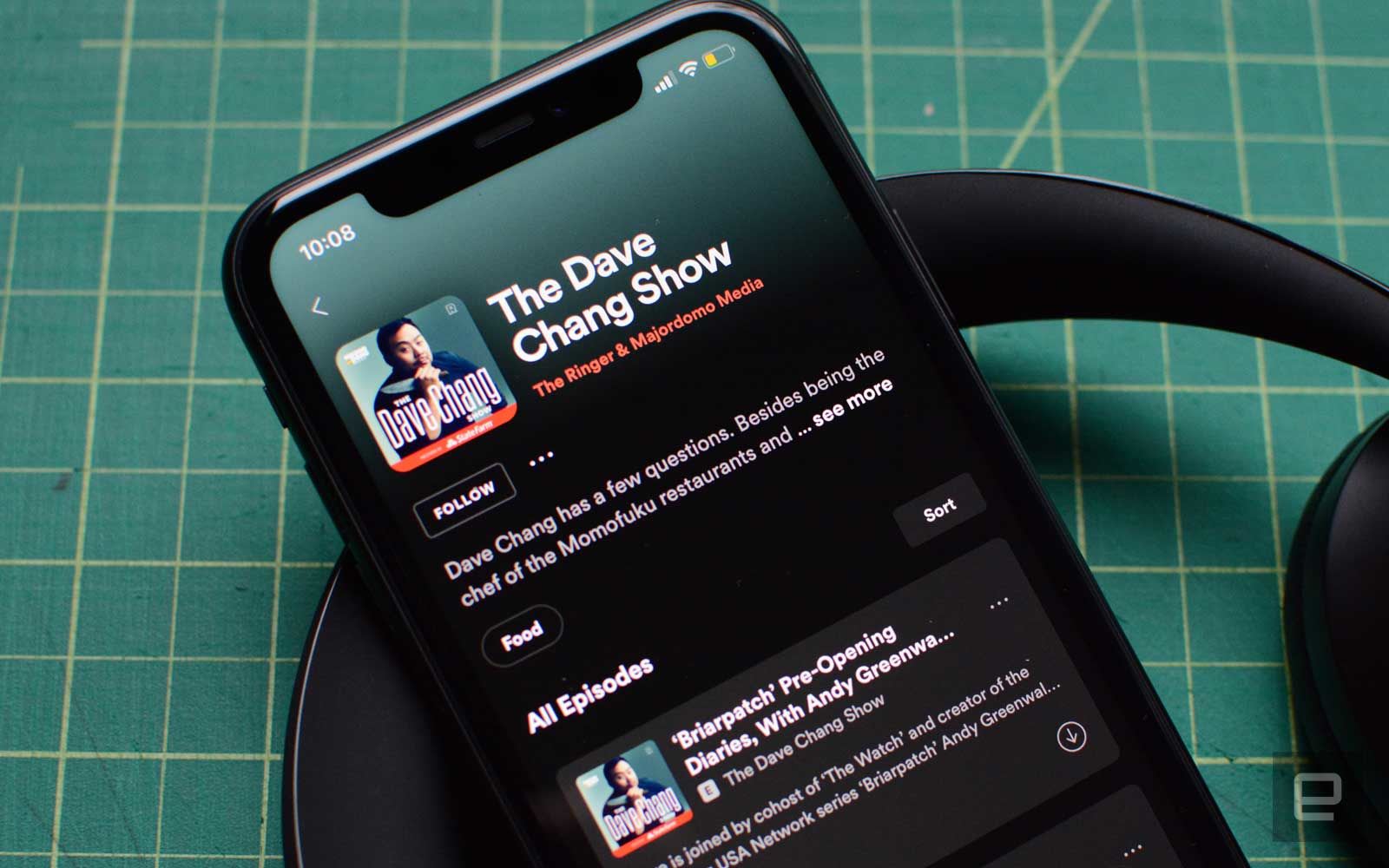
If its recent purchase of Ringer and podcast-related feature additions didn't make things clear, audio shows are a big focus for Spotify. So it was only a matter of time before the company started tweaking the podcast section of its app again. Thankfully, compared to Spotify's sometimes hit-and-miss redesigns, this latest one is a good one. It's also a more narrow redesign, with the company focusing its efforts on individual podcast pages.
Spotify has moved several interface elements to frontload useful information at the top of the screen. This is most apparent with the new placement of descriptions. They now sit underneath the "follow" button in the new design, which means you don't have to swipe to find out what a show is about. Underneath the description, Spotify has nested genre tags you can tap on to find similar podcasts.
However, the most significant tweak is that the new interface will place "trailer" episodes at the top of the episode list. If you're a frequent podcast listener, you've probably listened to trailer episodes without necessarily knowing. They're short, one- to two-minute clips designed to give you a good sense of what a show is about without listening to a full episode. Anchor, one of the companies Spotify acquired last year, recently added a feature to its app to make it easier for DIY podcasters to create trailer episodes, so it's not surprising to see Spotify put a greater emphasis on them. The thread connecting all the tweaks is that you can now find out more information about a show faster.
Over the last year-and-a-half, Spotify has been making both big and small tweaks to the podcast section of its app. For instance, the company recently made it so that you could add podcast episodes to playlists and created a daily playlist that surfaces new recommendations. Today's redesign is probably just the start of changes and enhancements the company has planned for 2020.
Source: Spotify
by: via https://www.AiUpNow.com/