Search visitors are some of the most motivated buyers on your site. In many cases, they’re searching because they know exactly what they want and how much they’re willing to pay for it.
For this reason, many companies are making eCommerce site search a core component of their strategy. However, many basic eCommerce search engines offered by shopping cart platforms fall short of consumer expectations.
eCommerce Site Search Best Practices
Visitors who use site search are typically 3 to 5 times more likely to convert than the average visitor, and the average order value is 25-50% higher than that of other customers.
In this blog, we're sharing some eCommerce site search best practices so that you can better optimize your online store and convert high-intent visitors in no time.
- Manage Your Synonyms
- Manage Redirects
- Support Persistent Queries
- Use a Bold Border & Button Color
1. Manage Your Synonyms
Most of the time that a site search fails to return relevant results, it’s because the search engine doesn’t understand the keywords in the query or how they relate to each other. There may be region-specific words or spellings that aren’t programmed into the engine or into your product data.
Failed site searches happen on every store, but how often are the happening on yours? Go into your Google Analytics dashboard, Behavior, and Search terms. From there, sort by Search Exits from high to low. You can change the data range to see if there are any changes.
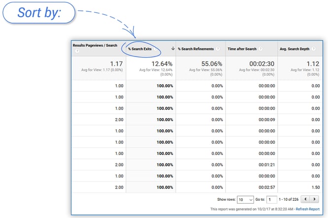
Any site search that’s resulting in a 100% search exit rate, or that has a Time after Search of 0:00 is likely returning irrelevant results, or perhaps no results at all.
There’s a good chance that some of these searches are synonyms for products that you sell. For example, if you sell pajama tops, but “PJ tops” is not in your product data, the search engine won’t understand that these two searches are for the same items.
So, how do you fix this? First, in your shopping cart dashboard, you may have the option of programming synonyms. This is by far the simplest option.
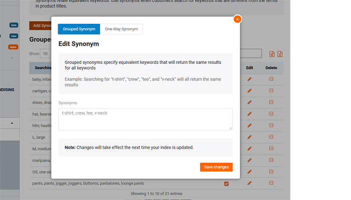
Second, you could manually add the keyword “PJ” to all pajama tops and bottoms. This would likely take a very long time and would require that you remember to do this with future products. To be clear, this is an overly simplified example, but the concept should apply to any store.
2. Manage Redirects
In addition to programming synonyms, redirects are another great way to get site searches onto the right pages. For example in some industries, it’s very common for shoppers to search for brand names. In the power tool industry, for instance, it’s common to see searches for “DeWalt."
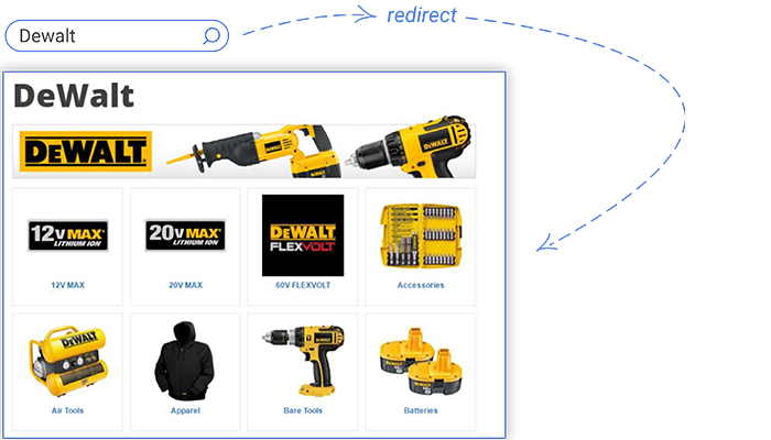
In most cases, this search will simply load a list of all products with the word “DeWalt” in one of their data fields. If this was a very common search, one of the best options would be to create a custom brand page to help guide users to the right set of products.
This tactic can be used not only for brand pages, but for any site search that is taking users to pages that aren’t helpful. If your search engine doesn’t support content searches, you could use redirects to take people to your policies, shipping, and contact us pages when they search for those terms.
There are many uses for these redirects that most retailers don’t fully utilize. Using the report in Google Analytics mentioned earlier can help you get an idea of what redirects would be useful.
3. Support Persistent Queries
If a shopper doesn’t find what they expect after their initial site search, they’ll generally refine their search. Sometimes they use filters or sorting, but a lot of the time, they’ll modify the text in the search box to get slightly different results.
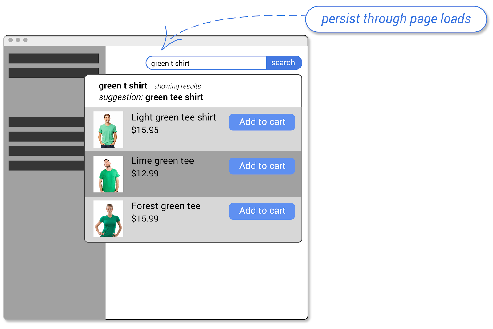
For example, if they first entered “aqua t shirt” and didn’t find the green-blue shirts they wanted, they might change “aqua” to “green."
Persistent search queries means leaving the text in the search box on the subsequent page. So after the user types the search, hits enter and loads the results, the query they entered should still be there.
This allows them to make quick edits to fix typos or adjust their search parameters to make the results more relevant. It’s stunning how many high-profile sites don’t support this behavior, so there’s a chance yours doesn’t either. This can lead to higher bounce rates on search pages and decreased conversions.
4. Use A Bold Border & Button Color
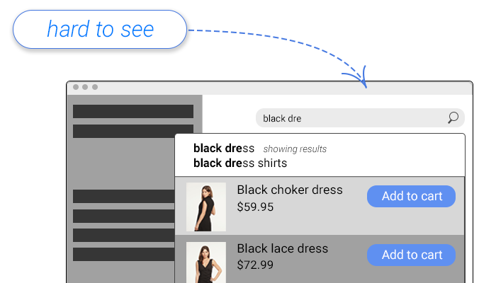
Another simple, inexpensive and effective way to optimize your search area has to do with colors. As mentioned earlier, many designers have sought clean and minimalist designs.
One way to make a design look simple is to use a muted color palette. This can look very enticing, but makes it hard for important elements to stand out.
In our study, we found that sites that used bold borders and button colors had double the search usage of those that went for muted, monochromatic designs.
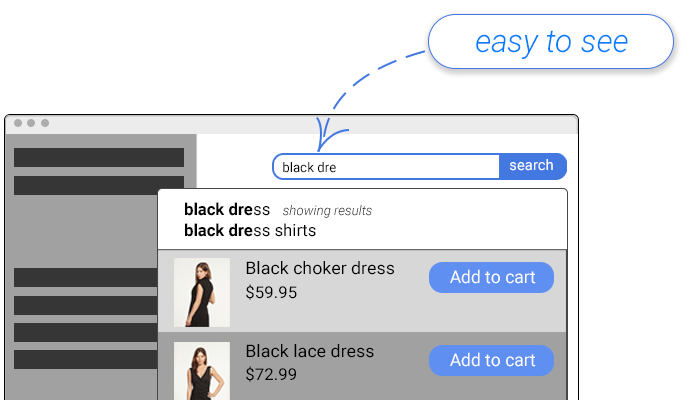
Using your brand’s accent color, put a bold border around the search bar so that it stand out. Most designs also use a search button to the right of the entry field.
Using that same accent color here makes the entire interface easier to see. If you don’t use a button in your design, you might consider making that change as well.
Many of these changes are inexpensive and easy to do, so it’s certainly worth testing to find out what works best on your site.
Conclusion
Optimizing the eCommerce site search experience is one of the best opportunities for eCommerce retailers to improve engagement scores and increase sales. Don't forget to test to find out the best design, colors, etc. that work for your brand.
We hope that you're able to convert high-intent visitors after implementing these eCommerce site search best practices. If you have any questions or would like to know how Groove can help, contact one of our certified eCommerce experts through the form below. We'll be in touch!
May 20, 2020 at 12:51AM
via https//www.brucedayne.com/
danielle@groovecommerce.com (Danielle Toledo), Khareem Sudlow
