Curious what Surface Duo was like when it was a Windows device? Wonder no more.
Here at Windows Central, we've been following Microsoft's Surface Duo project for quite some time. We first wrote about Microsoft's dual-screen pocket PC efforts under the codename Andromeda in 2017, and I had started hearing about the project a considerable time before then. It was initially going to be a Windows device, and kickstart Microsoft's mobile efforts with a brand new, modern version of Windows explicitly built for this new form factor.
Of course, this never happened. The Surface Duo we have today is an Android device, and Microsoft says that it went with Android because it's the right choice for the form factor. While true, it's certainly not what Microsoft had intended to do in the beginning. It came to this conclusion only after trying and failing to bring to life a new, ambitious version of Windows designed for a dual-screen pocket PC.
I'm frequently asked about what this era of Surface Duo's development was like. So, here's what I know, based on conversations with people who worked on the project and photos and video I've seen of the software and hardware over the last four years.
Pre-Andromeda
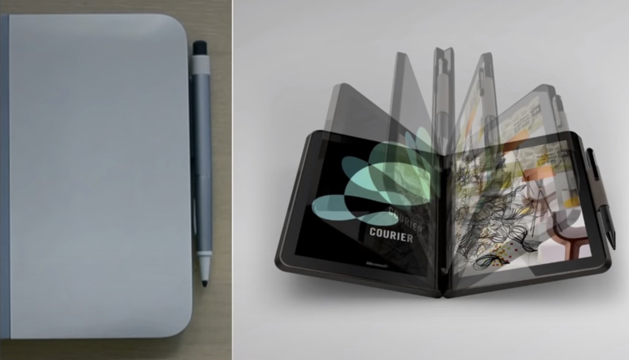
Microsoft has been kicking around the idea of a dual-screen device since as early as 2009, with the now infamous Microsoft Courier. Of course, the Courier never saw the light of day as it didn't align with Microsoft's Windows strategy at the time, but as we now know, the Courier was just the start. Microsoft would continue to research and prototype dual-screen devices for years to come.
Although not directly related, those working on what ultimately became the Surface Duo took plenty of inspiration from the research and development that was put into the Courier. Microsoft began working on what I'd consider to be what eventually became the Surface Duo in the late 2014 or early 2015 timeframe, a few years after the Courier project was put to rest.
Intel and ARM were considered.
Around this time, Microsoft had started conceptualizing the idea of a (possibly Intel powered) dual-screen pocketable Surface running what would eventually become Windows 10. In these early internal concepts, Microsoft showcased an adaptable UI that would switch between mobile and desktop experiences when moving between single-screen, dual-screen, and a large external display.
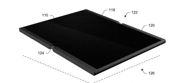
The dummy prototype hardware featured a more traditional smartphone shape housed in a thin metal chassis with pen support, and I'm told they called this early prototype idea the "Surface Pocket." It appears the powers that be at Microsoft liked the idea, and work began on what would eventually become the Surface Duo soon after.
A lot would change between those early concept ideas and the final product. Everything from the shape, size, processor, market positioning, and the operating system would be different by the time the product was publicly announced in October 2019. Today, I want to detail that journey and talk about what this device would be like had it shipped with Windows back in 2018.
Project Andromeda
Work on Microsoft's dual-screen phone started picking up steam in early 2016, under the codename Andromeda. Microsoft started development on the Andromeda project with the mindset that it was going to be a Windows device. It was decided early on that Andromeda was not going to be powered by an Intel processor, opting for an ARM chip instead.
It became apparent rather quickly that Microsoft needed to build a new, modern version of Windows to fully realize its vision for this device. The existing version of Windows 10 was and is not optimized for pocketable devices, and Windows 10 Mobile wasn't adaptable enough or where Microsoft needed it to be for a dual-screen form factor.
Microsoft wanted the best of both worlds, a lightweight and legacy-free OS experience found on Windows 10 Mobile, paired with the versatility and feature-rich nature of Windows 10 desktop, something especially important for Microsoft's Continuum plans on Andromeda. A version of Windows like this didn't exist at the time, so Microsoft needed to build it.
WCOS + CShell
Microsoft began work on what would eventually become Windows Core OS (WCOS,) a modern and legacy-free Windows foundation that is modular and easily adaptable to new and existing device form factors. WCOS originally started as something specific to Andromeda but quickly grew into something much more extensive and is now what also powers HoloLens 2 and Windows 10X today. Andromeda's version of WCOS was fittingly codenamed "AndromedaOS."
Andromeda was going to be Microsoft's first device to ship with a version of Windows built on WCOS and showcase to the world the future of Windows for both developers and customers. WCOS was and still is significant to Microsoft, as it's essentially a better version of Windows 10. It's more modern, secure, and lightweight, with better battery life and faster OS updates.
In addition to the modern core, Microsoft also needed an adaptable UI that would work in conjunction with Andromeda's many postures. It couldn't use the existing Windows Shell from Windows 10 desktop or Windows 10 Mobile, because those shells are not adaptable and are dependent on legacy components that are no longer part of WCOS.
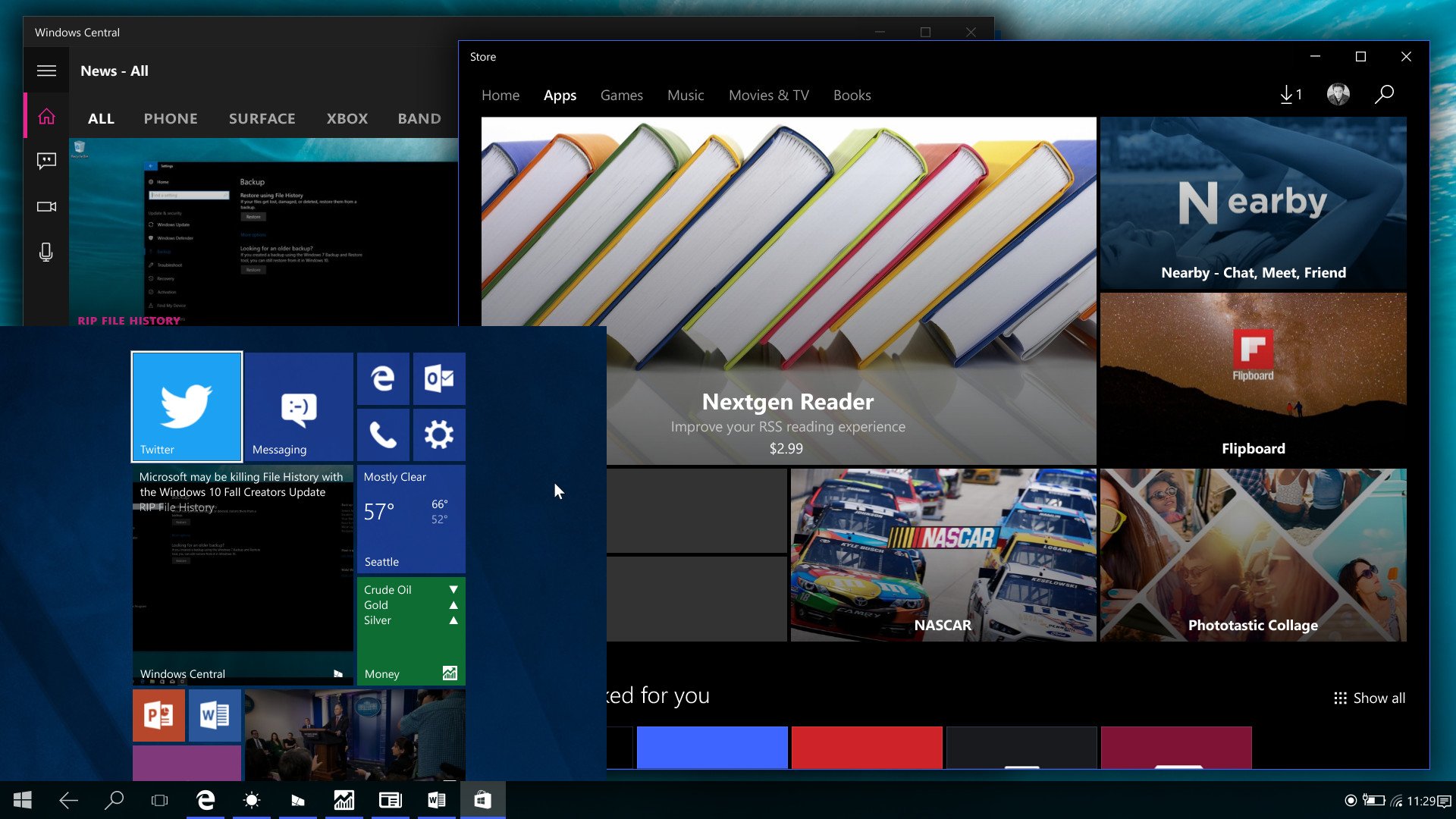
So, Microsoft began work on a Composable Shell (CShell) that would allow WCOS to feature modern Windows Shell experiences that could adapt and be shared across different WCOS variants. This would be vital for a device like Andromeda, which could swiftly go from a single-screen phone to a dual-screen tablet and dock to a larger display for a desktop experience too.
Andromeda was pioneering two massive software efforts with WCOS and CShell
Andromeda was pioneering two massive software efforts at Microsoft with WCOS and CShell, with the hope that work put into this project could later be reused on different products thanks to the modular and adaptive nature of both. This was a huge effort internally, and people at Microsoft were excited about Andromeda, and the future of Windows it was pioneering.
However, it became clear rather quickly that this project would take a while, and not be without issue. It turns out that modernizing and modularizing the Windows core and shell experiences isn't an easy task, and the project would soon fall behind schedule. WCOS itself wouldn't be ready for self hosters and engineers to actively test on until sometime in 2017.
It was around this same time that Microsoft decided to pull the plug on Windows 10 Mobile. The company didn't want to build stereotypical smartphones anymore, and Satya Nadella was quoted saying that its future phones would not look like normal phones, referring to Project Andromeda.
Interestingly, because WCOS wasn't entirely ready for selfhosters until mid-2017, early CShell work was carried out on top of Windows 10 Mobile. Microsoft had originally planned to ship CShell on Windows 10 Mobile under the codename Pheonix, but that plan very quickly went away once the company decided to wind down its existing phone efforts in early 2017.
The Journal Experience
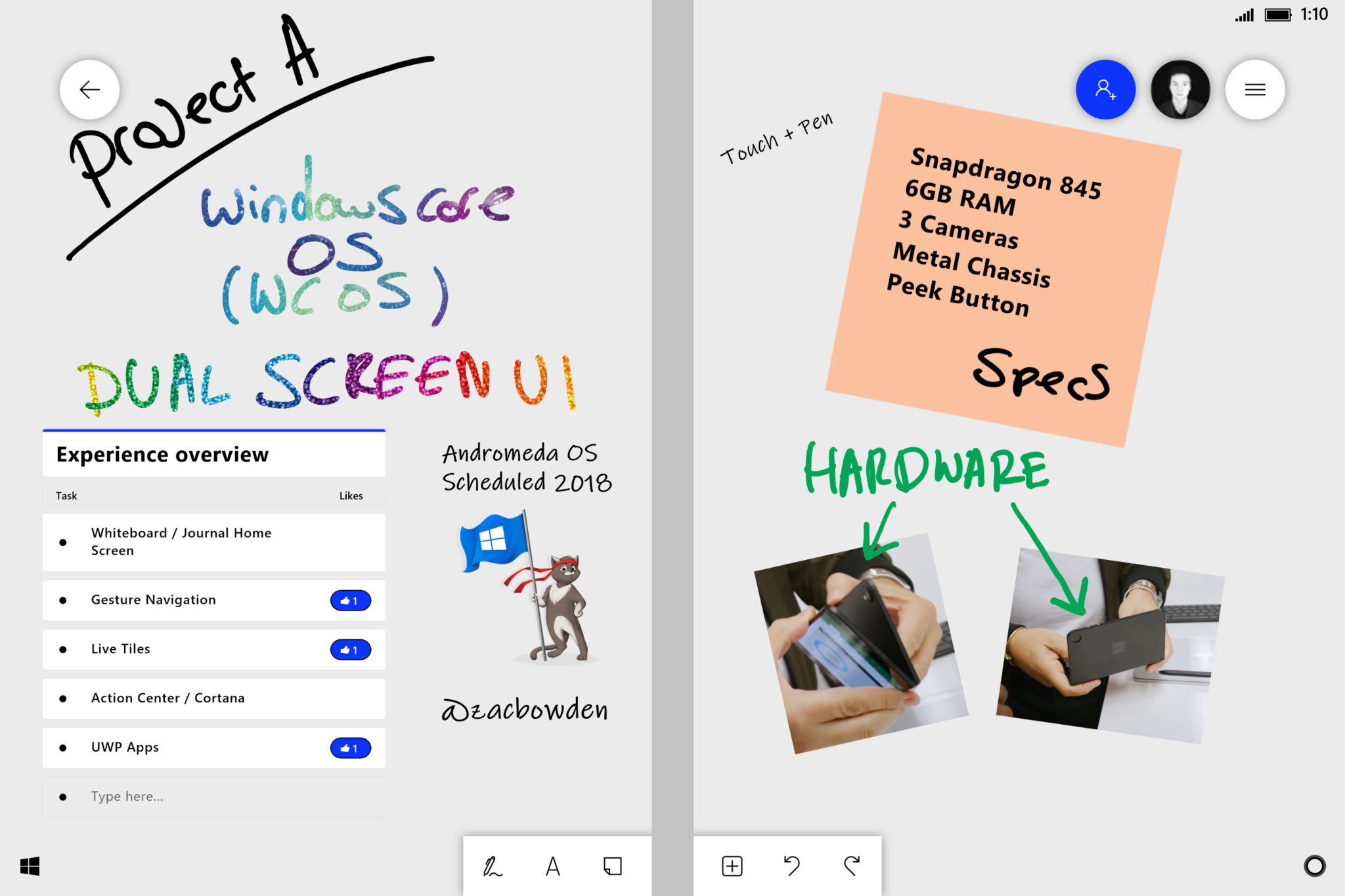 Andromeda's ink-focused home screen experience.
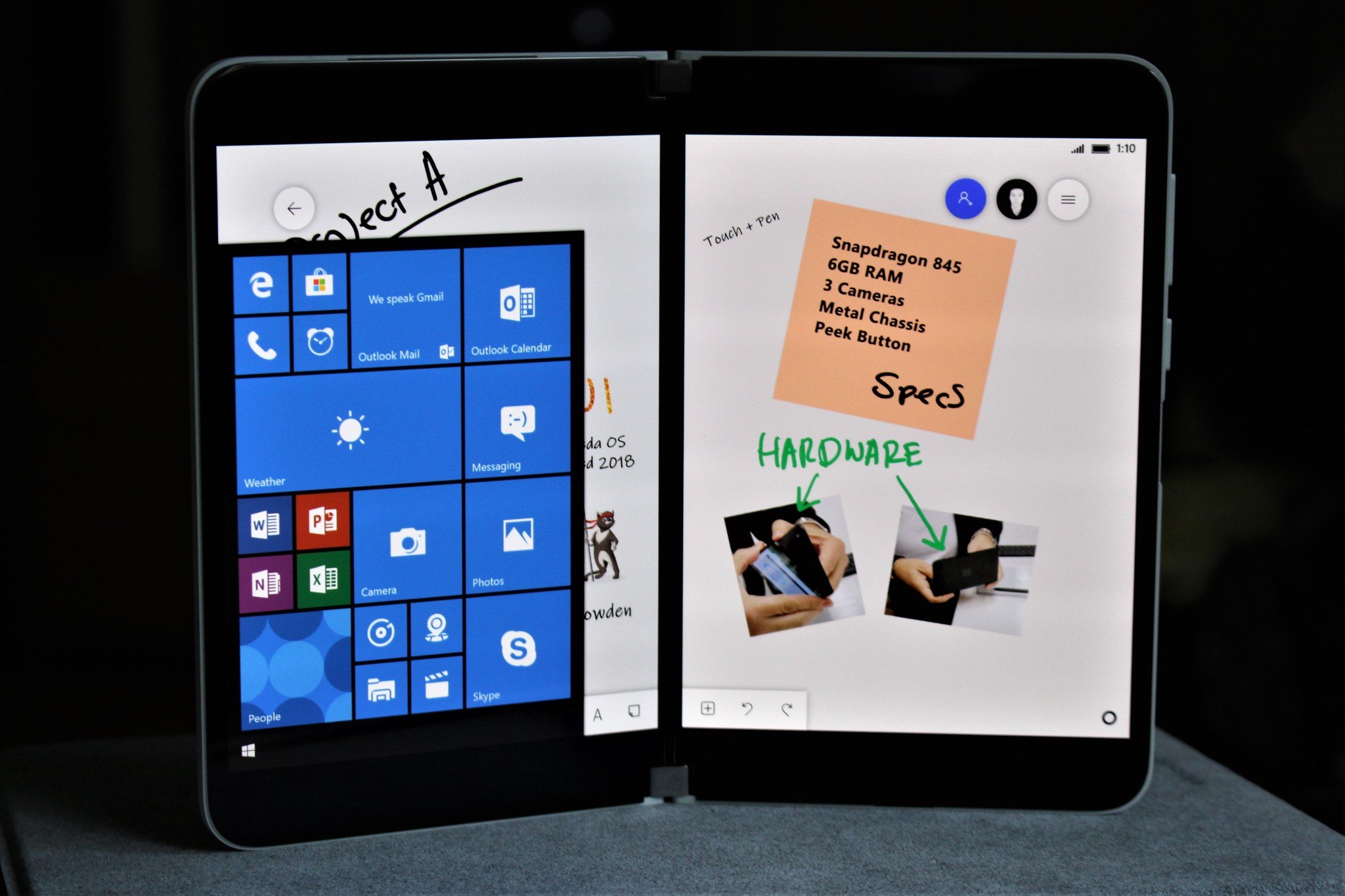
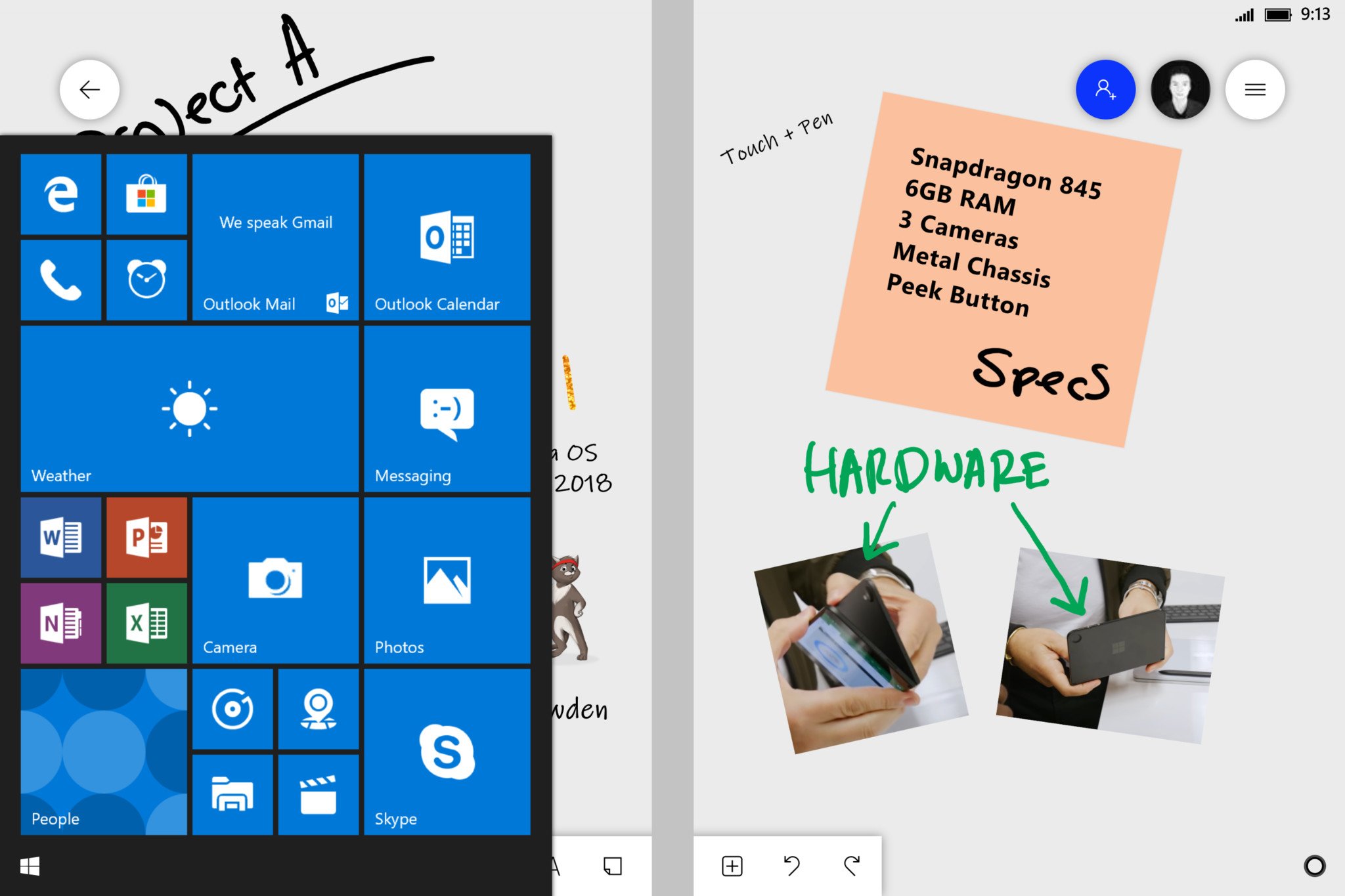
Full disclosure, screenshots in this article are recreations of real code that I've seen in photos and videos. I'm unable to post the actual material to protect sources, so I've faithfully recreated them pixel for pixel.
Throughout 2017, the user experience and feature set that Microsoft was building for Andromeda came into focus. When I first saw photos of Andromeda running its version of WCOS, I was shocked and excited to see that it was not like any version of Windows before it. It was a sort of hybrid between Windows Phone, Windows Desktop, and the Courier.
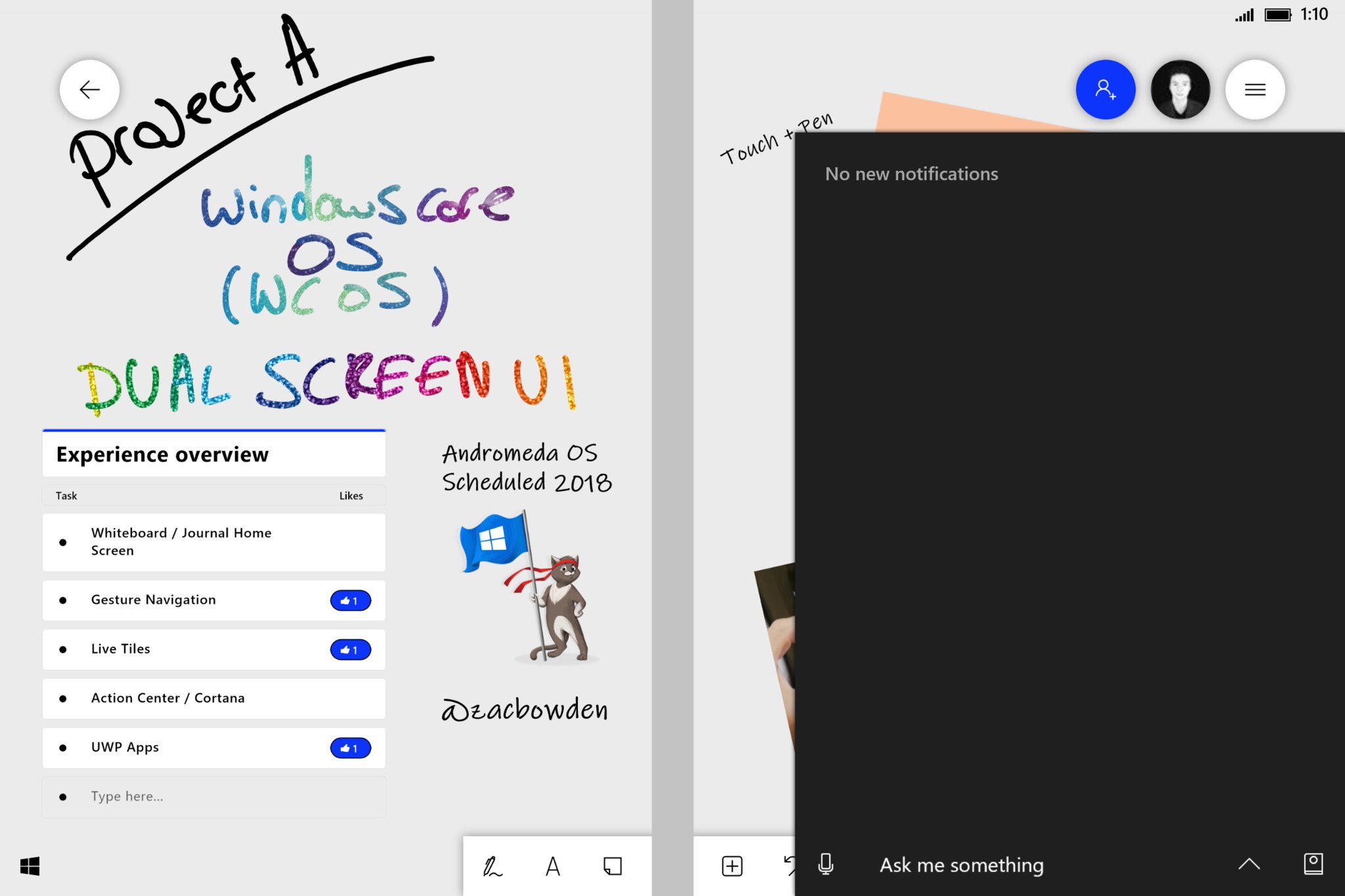
AndromedaOS featured a user experience built around a journal app, codenamed Jamdani. This app mimicked a real journal, with virtual pages that could be turned and was designed primarily for pen input. You could attach virtual sticky notes, images, and files, and annotate on them. What's interesting is that this journal experience was the home screen.
Instead of being taken to a traditional app launcher with a custom wallpaper and app list, the home screen was this interactive journal. This is what I mean when I say the project took inspiration from the Courier. Microsoft was really focused on the pen experiences with Andromeda, and that's reaffirmed by the journal experience it was building for the device.
The journal experience would later be replaced with what became the Microsoft Whiteboard app. Many of the experiences between the journal app on Andromeda and Whiteboard app on Windows 10 are much the same, so if you're interested in checking out what this experience was going to be like, download the Whiteboard app.
The Andromeda UX
As far as I'm aware, very few outside of Microsoft have ever seen AndromedaOS. While I'm unable to share real screenshots, I have recreated images that I've seen of old Andromeda prototypes running Windows so that you can have a better idea as to what things looked like. I'll explain the UI as we go.
This first image is of a build of AndromedaOS from around mid-2018. At this point, Microsoft had switched out the journal app for the Whiteboard app, but it functioned very similarly. In the bottom left corner is the Start button, where you'd usually find it on Windows. In the far right is the Cortana button, which also housed the Action Center.
The OS was heavily gesture-based, with a swipe in from the left opening the Start menu, and swipe in from the right opening the Action Center. A swipe down from the top revealed a Control Center for things like Airplane Mode and Bluetooth settings, and a swipe up would reveal Task View or allow the user to drag an app to span it across both screens.
Any app the user would open would sit on top of the journal, meaning the journal was always available to the user by swiping an app away to go home. I'm told Microsoft was working on the way to disable the journal if you prefer a more traditional home experience, but I never saw the option in action.
The Action Center is rather interesting on AndromedaOS. Microsoft had combined both Cortana and the Action Center into one area, with Cortana now being the "manager" of your notifications. Notifications would be sorted into the Action Center, and the Cortana icon would pulsate in the bottom right to alert you when you've missed a notification.
Andromeda Continuum
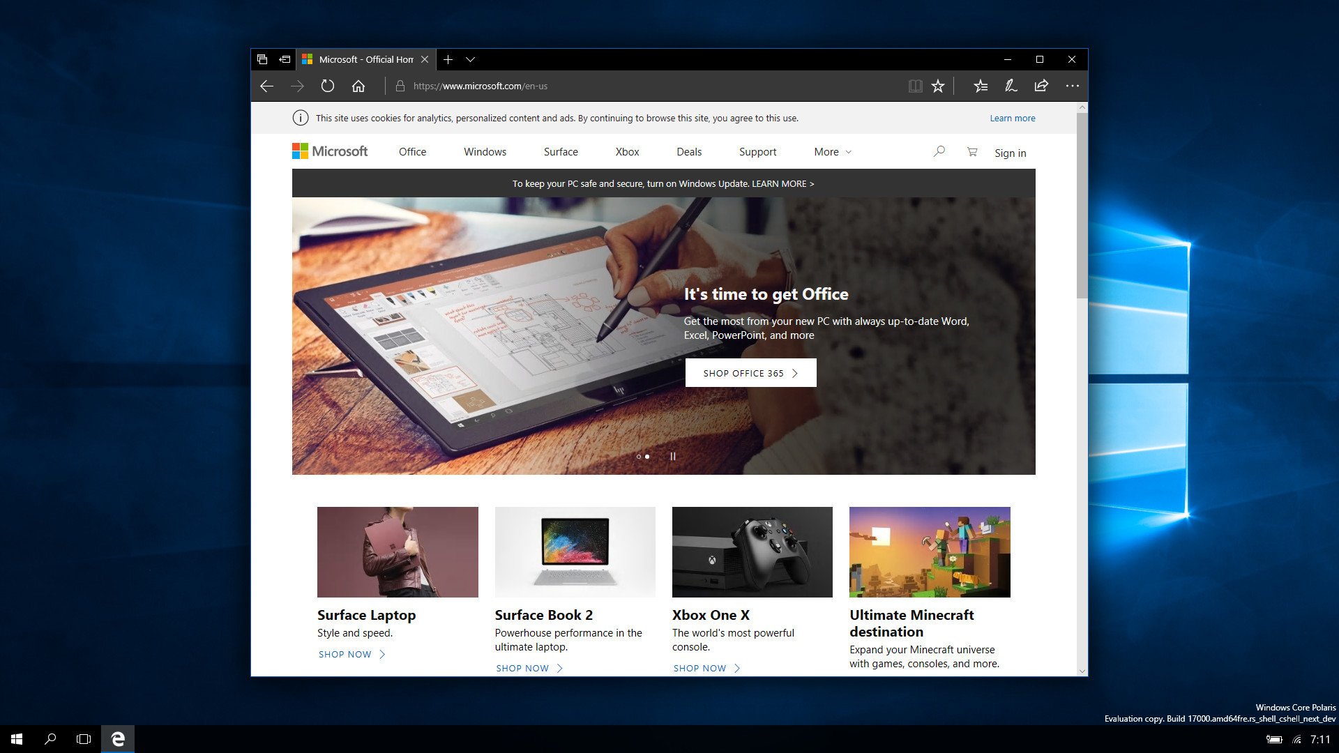
One of the reasons Microsoft wanted to build a Composable Shell was so that it could bundle multiple shells into one version of Windows for device form factors that could take advantage of it. In addition to AndromedaOS, Microsoft also began work on a version of WCOS for desktop, codenamed Polaris. This was essentially going to replace Windows 10 S.
Polaris featured a more traditional desktop environment, except rebuilt from the ground up using modern code. Microsoft were building a version of WCOS that looked like Windows 10, but with an entirely modern core and no legacy components. It was an exciting prospect, and from memory, I remember the builds featuring fluid animations for things like the Start menu.
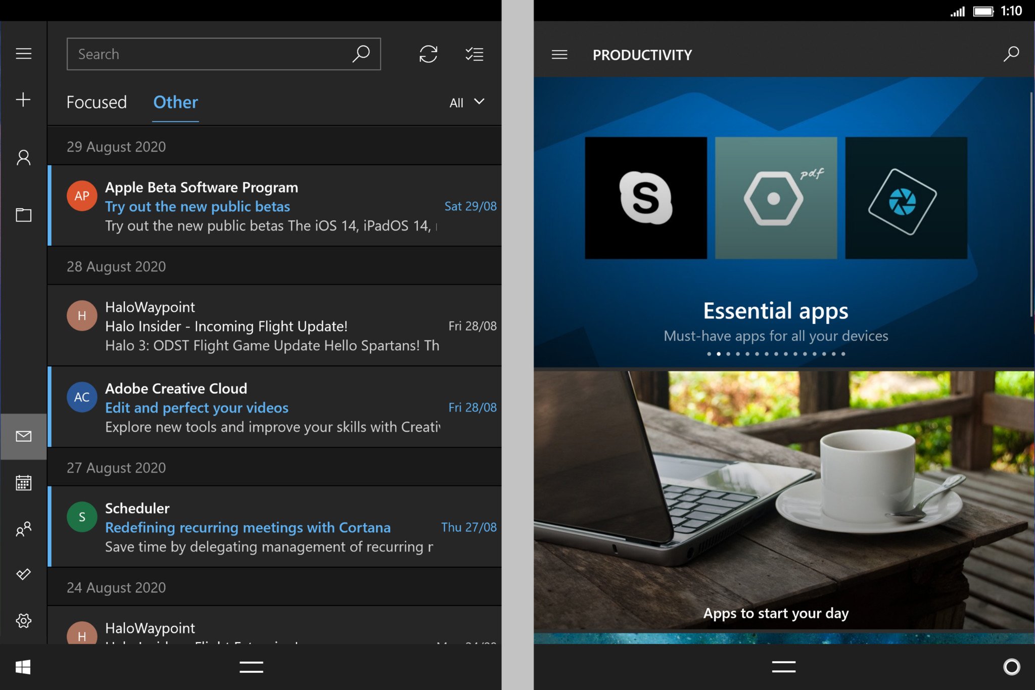
Because of the nature of WCOS, Microsoft could recycle the work it was doing with Polaris and use it on AndromedaOS for Continuum. When a user docked Andromeda to a larger display, it would display the Polaris Composer, and the idea was that with Andromeda, you could bring an entire PC with you in your pocket.
Continuum on Andromeda was called Productivity Mode, I believe, and was going to be a fully-featured desktop environment, not like Continuum on Windows 10 Mobile was. Polaris, like AndromedaOS, were both postponed indefinitely around the same time.
The Andromeda Hardware
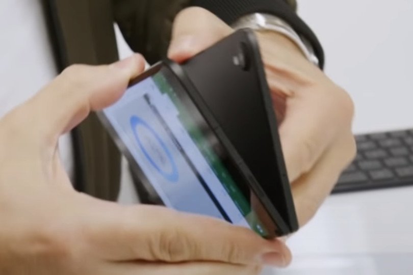
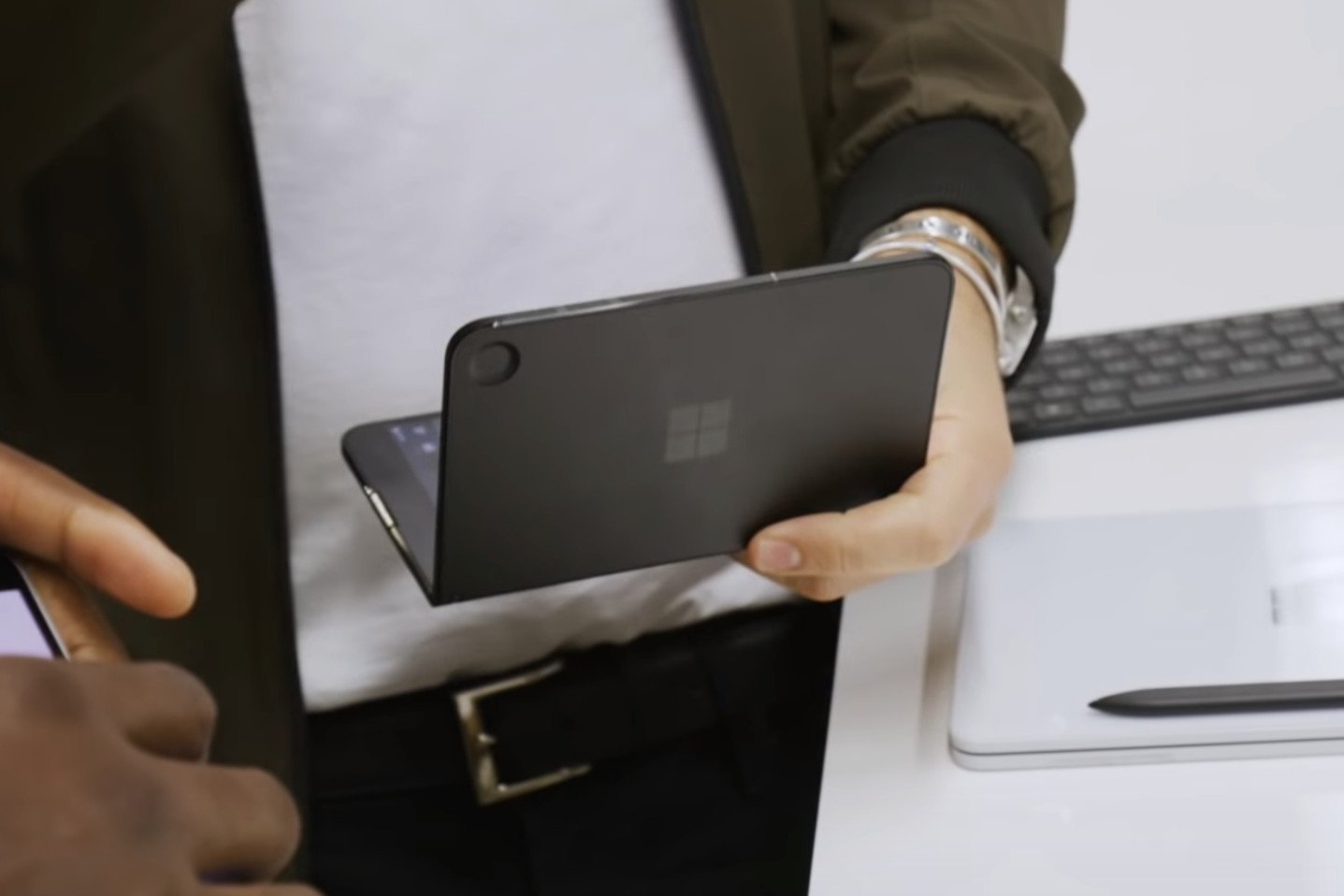 Andromeda prototype with camera "divot."
The Andromeda hardware prototypes are notable because they are somewhat different from the shipping product we know as Surface Duo. Everything from the outer material to the number of cameras changed between 2018 and 2020. There were four engineering variants of the Andromeda hardware, which go back a handful of years.
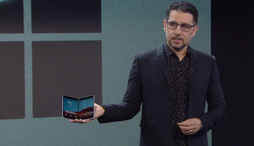
Unfortunately, I'm not allowed to share photos of the prototypes I've seen for obvious reasons. I can describe the hardware, however, and luckily Microsoft has already given us a brief look at an Andromeda prototype as Panos Panay was spotted using one when briefing Marques Brownlee on YouTube. So I'll be using screengrabs from his video.
It's worth mentioning that not all Andromeda prototypes were equal. Some of the features I mention here are not present on the device showcased in the images in this article. With that in mind, let's start with the outer shell, which was not glass. Unlike Surface Duo, Andromeda used a metal chassis for its outer shell, providing a very different feel in the hand.
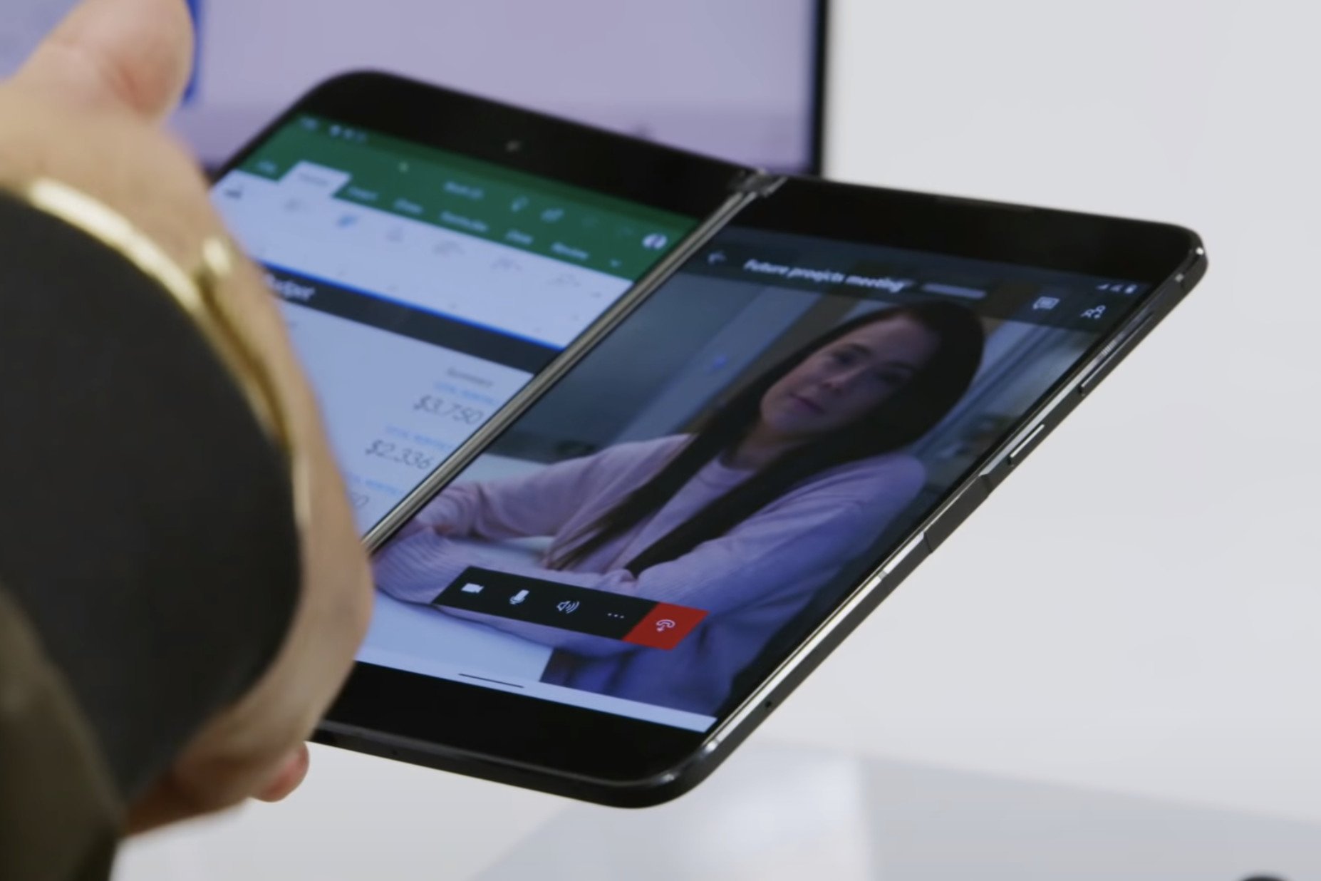 Metal frame with antenna bands on Andromeda prototype.
The devices themselves were also not white, featuring a darker grey/black appearance. The shapes and sizes between Andromeda and Surface Duo are somewhat similar, which I find to be fascinating. Microsoft has been hell-bent on making this product as thin as possible, and its shape and size design has been deliberate since the early days.
Because Andromeda was metal, the sides of the device needed antenna bands, a design trend found on most smartphones. When Microsoft moved to glass on Surface Duo, it also switched out metal for polycarbonate around the edges, allowing them to rework the antenna system and hide those antenna bands.
Some of the most significant changes between Surface Duo and Andromeda are with the cameras. Earlier Andromeda prototypes had three cameras, two external and one selfie camera on the inside above the left display. This stands in stark contrast to Surface Duo, which has just one camera on the inside above the right display.
I'm told the external cameras on Andromeda were a 12MP main shooter, and a monochrome lens, which, when paired together, enabled unique Mixed Reality experiences that the company was planning to push with this device. A user could scan a 3D object with Andromeda and view it in the real world on a HoloLens 2, for example.
The main shooter featured a prominent camera bump, which caused issues for the form factor. As Andromeda (and Surface Duo) are designed to fold 360-degrees, the existence of a camera bump meant the device couldn't fold all the way. This was a problem when using the device in single-screen mode when taking phone calls, for example, as the product wouldn't sit flush with itself.
To combat this, Microsoft built in a camera "divot" on the opposite side of the external chassis, so that when in single-screen mode, the camera bump didn't affect the form factor. This looked unsightly in the photos I've seen, and I think the Surface design team agreed, which is why we don't have an external camera on the Surface Duo.
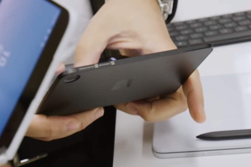 Closer look at the camera "divot."
It also took up a lot of extra space on the inside of the product, as you now had an area of dead space just so the camera bump wouldn't affect the usability of the device when folded 360-degrees. I guess between the last Andromeda prototypes and the first Surface Duo prototypes, Microsoft decided not to compromise on its external design. A decision I agree with.
The later prototypes featured 6GB RAM and a Snapdragon 845, which was current at the time. Had Andromeda not been delayed, the product would have launched with the latest specs for 2018. Earlier prototypes featured a Snapdragon 835, meaning the Andromeda form factor went through three whole processor generations before finally being released as Surface Duo.
Because of how pen focused Andromeda was, the hardware had dedicated magnets that allowed the Slim Pen to attach to the front. Finally, some prototypes featured what people have called a "Peek Mode" button, located on one side of the device. The button, when pressed, would snap the device open to a certain angle to reveal the lock screen date, time, and missed notifications.
The idea for Peek Mode makes much more sense with this button. However, it's completely missing on the shipping version of Surface Duo. Hopefully, that idea makes a return in the future, as it sounds super cool.
Behind Schedule
So, why did the Andromeda project ultimately get canceled? There's no one specific reason, I'm told. It was a combination of many things; the lack of mobile apps being a primary concern. But, a handful of sources have also mentioned that quality concern was another big player in its cancelation. Builds were buggy, it wasn't meeting deadlines, and people on the project were becoming increasingly frustrated.
The first big milestone that the project missed was crucially related to fighting the app gap problem. Microsoft had originally forecasted plans to unveil Andromeda and WCOS to the world in March 2018, and begin shipping an "Insider Edition" device to developers so they could start building apps for this new form factor.
Had Microsoft stuck to this timeline, the product would have "officially" launched in the fall of 2018, giving developers time to port their apps to UWP and adopt dual-screen scenarios. But when Microsoft failed to deliver this initial developer preview, the future of Andromeda was put in doubt.
Project Andromeda, like most projects internally at Microsoft, went through a weekly review process with the senior leadership team (SLT.) It's in these weekly reviews where those in charge were updated with the progress of features, bug fixes, timelines, and more.
I understand that it was in these SLT meetings that the decision was made to postpone Andromeda indefinitely. Again, sources have pointed to a number of different reasons as to why this decision was made. Several sources have mentioned that the SLT grew tired of the constant issues and delays, and a decision to postpone was somewhat driven by this.
Andromeda was postponed, with no sign of ever returning.
The constant delays were frustrating to the Surface team above all else, who really wanted to ship a Surface phone in this form factor. But at some point in the middle of 2018, the decision was made to postpone the project indefinitely, sealing the fate for AndromedaOS and Windows on phones.
The project was behind schedule and showed no sign of catching up. This, added to the fact that the product had a major app gap problem made the decision to cancel the project the right one. Microsoft did consider emulating Android apps on top of Windows before this, but there was no viable end-user experience that could be built around sideloading Android APKs.
As far as I'm aware, many of the people working Andromeda moved over to Windows 10X, which, thanks to the nature of WCOS, were able to reuse much of the work that was originally put into AndromedaOS. Windows 10X, in many ways, is a spiritual successor to both AndromedaOS and Polaris.
Project Epsilon
While AndromedaOS was no longer happening, the Surface team still had the hardware ready to go, and they still wanted to ship it. At some point in late 2018 or early 2019, the decision was made to turn Andromeda into an Android device. This was kept very quiet, as most people who worked on the Windows version had no idea this decision had been made.
When Microsoft decided to repurpose Andromeda with Android, it also decided to change its codename. This was likely for two reasons. One, to stop people like me from finding new information about its progress, and two, because the "Andromeda" codename was very much tied to Windows. After all, it's what started the whole WCOS thing.
When Microsoft did move to Android, it didn't immediately have a team on hand that could jump in and begin working on the Android OS enhancements and customizations it needed to bring this form factor to life, so it contracted third-party vendors such as Movial to do that initial groundwork. Many of those third-party vendor employees are now full time at Microsoft.
Microsoft ported several Windows drivers to Android for Surface Duo.
I am told that because Epsilon was based on Andromeda, a Windows product, Microsoft had to port over some Windows drivers to Android, including the touch and pen driver, as well as Microsoft's own UEFI. I remember hearing stories about early Epsilon prototypes having the touch driver crash very frequently, which might be why Panos Panay didn't touch the device on stage in October 2019.
As the Surface team waited for the software to be done, it got to work on readjusting the hardware throughout 2019. It removed the external cameras, swapped out the exterior material from metal to glass, reworked the antenna system, moved the internal camera, and polished things up for the hardware's unveiling in October 2019.
I believe Epsilon went through three engineering verification testing (EVT) stages before entering production. The early units didn't have a front-facing flash, at least not to the naked eye. Either way, the Surface Duo, while missing some of the features and ideas Microsoft were experimenting with on Andromeda, is a clean, concise, and deliberate hardware design.
A long journey
Surface Duo, in my opinion, has the most interesting and dramatic development journey of any Surface product to date. It's a device Panos himself has wanted to build for a long time, but it was constantly held back because of unfinished software. Microsoft tried hard to deliver a version of Windows for Surface Duo, but it failed.
For now, Windows for pocket-sized devices is dead, and I'm not aware of any plans internally to revive that idea in the future. There's no plan to bring Windows 10X to Surface Duo, and the company is now all-in on bringing Android to life on Surface Duo and future versions of the hardware.
To the dismay of Windows fans everywhere, the decision to move to Android on Surface Duo was the right one. Had Microsoft shipped it with Windows, the app gap would have killed it anyway. At least with Android, there's no immediate software concern that kills the product outright. Surface Duo 2 is in the works, and Microsoft has some big plans for Android.
So, that's Andromeda. It's been a long ride, for Microsoft and for fans. What are your thoughts? Let us know in the comments.
Updated September 18, 2020: Clarified that initial CShell work on Windows 10 Mobile may have been intended to ship at some point, but never did once Microsoft decided to kill off Windows Phone in early 2017.
via https://AiUpNow.com September 18, 2020 at 10:01AM by Zac Bowden, Khareem Sudlow,
