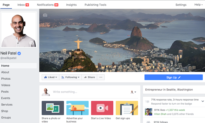
It seems like every week there’s a new article about how people don’t use Facebook anymore. You may hear that it’s only for “old people,” that it’s not relevant, that brands are abandoning it.
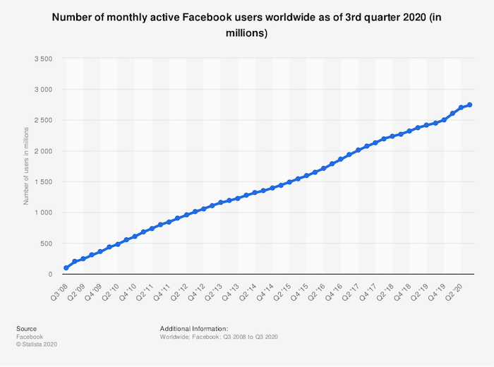
Thing is, that’s just not supported by the user data. In reality, Facebook has barely seen a slowdown in audience growth at any point in the last 12 years. It’s been super consistent:
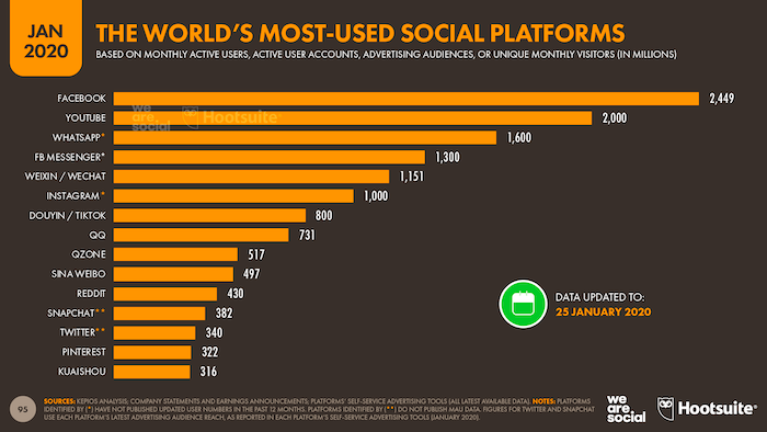
With approximately 2.5 billion monthly active users, Facebook is comfortably bigger than Twitter, Snapchat, Reddit, and Instagram combined.
So what does this tell us?
Simply put, if you’re a brand, you can’t afford to ignore Facebook. It might not be your audience’s favorite social platform, but they’ll almost certainly be on there, which means you need to be, too. You should be using it to promote your products, advertise your brand, and generally represent your company.
The starting point for all of those things is your Facebook Business Page. Your current and prospective customers or subscribers will visit it to check you out, see what you’re talking about, and engage with your content.
What’s the first thing they’ll see? Your Facebook cover photo. Read on to learn how to make a Facebook cover photo that shows off your brand in the best possible light.
Steps to Create an Effective Facebook Cover Photo
Ever heard of Hitchcock’s rule? Named for the legendary movie director, it states that the size of an object on-screen should be proportional to its impact on the story at that specific moment.
Well, given that your Facebook cover photo takes up almost half the page on desktop …
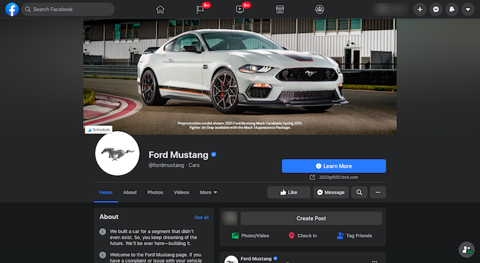
… it’s reasonable to say Facebook considers it pretty important! You’ve got a whole lot of digital real estate to play with, so you definitely want to make it count.
Designing a Facebook cover photo for your business page is much more than just choosing an eye-catching picture, cropping it to the right dimensions, and publishing it. Here are five key considerations to creating a cover photo that draws your audience in.
1. Keep Your Facebook Cover Photo Simple
Facebook used to say only 20 percent of your cover photo could be made up of text, but it dropped that rule in 2013.
With all that space to play with, and no limit on the amount of text you can include, it’s tempting to cram in as much information as possible. Don’t do that.
When it comes to creating an impactful Facebook cover photo, simplicity is your friend. Focus on communicating a single message as clearly as possible, so your audience is in no doubt of what you’re trying to say.
Apple does this better than most. While the tech giant famously doesn’t really “do” social, its branding on Facebook is still spot on.
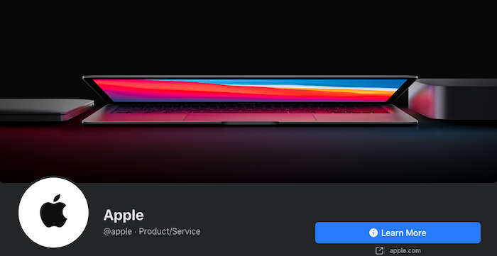
Apple’s Facebook cover photo is an exercise in simplicity: no words, just one clean and instantly recognizable product image showcasing its iconic MacBook. The use of color is super effective, naturally drawing your eyes to the center of the image.
2. Complement Your Brand Through a Facebook Cover Photo
Can you sum up your entire brand in a single image? It’s not as simple as it sounds! But that’s exactly what you need to do with your Facebook cover photo. If it doesn’t complement your brand, you risk confusing your audience.
Adidas is a huge brand that sells everything from skateboarding sneakers to golf attire. It’s pretty tricky to encapsulate such a huge brand in one picture, so Adidas has chosen to combine three separate images for its Facebook cover photo.

This works really well, allowing the brand to speak to three different markets at the same time. In one cover image, Adidas encapsulates men’s and women’s sportswear, plus streetwear.
3. Keep Your Audience Front of Mind
As humans, we find it easier to connect with people than abstract concepts or inanimate objects. That’s why so many of the best Facebook cover photos feature images of people.
Of course, if you’re going to represent and speak to your audience through your cover photo, you first need to understand who they are. Fortunately, Facebook gives you a couple ways to find this out:
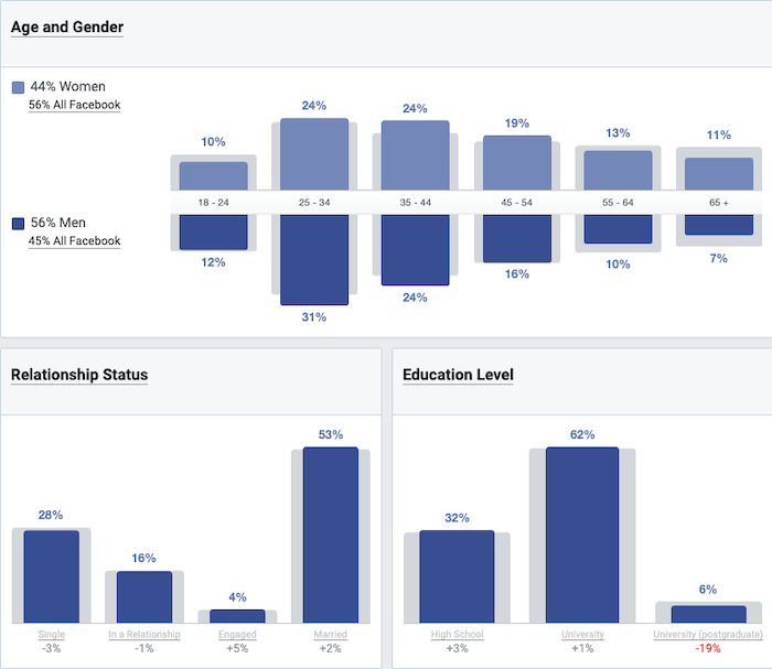
Facebook’s Audience Insights tool allows you to deep dive into the demographics, page likes, location, and Facebook activity of people who follow your page, are based in your area, or are interested in brands like yours. For instance, here’s a bunch of demographic information for people who like Major League Baseball:
By visiting your Facebook Business page, you can find out who engages with it most in the Actions on Page section. It shows you who clicked your contact information, call-to-action (CTA) button, or website, and segments the information by age, gender, device, and location.
So what does all this information tell us? Well, say you discover 80 percent of the people who follow your page are men, 75 percent live in Mexico and speak Spanish as their first language, and 90 percent are between the ages of 18 and 25. Your Facebook cover photo should probably incorporate a young Mexican man and maybe some Spanish text.
Here are a couple of examples of how Google targets its various audiences through its cover photos. First off, the brand’s UK Facebook page incorporates a bunch of cartoony imagery featuring recognizably British landscapes and structures like the Angel of the North, Stonehenge, and a red London bus.

Meanwhile, the Google Students cover photo features pictures of young people from diverse backgrounds, often working in teams, and all using technology. In other words, they’re exactly the sort of people you’d expect to be interested in a Google page aimed at students.

4. Pair the Facebook Cover Photo With Your Profile Pic
Just as your Facebook cover photo should complement your brand, it should also go hand in hand with your profile picture.
That’s really important because they sit alongside one another at the top of your Facebook Business Page. If they don’t fit together naturally, the results can be pretty jarring.
Nike is America’s most famous clothing and footwear brand, with 99% audience recognition, so it’s no real surprise that the company gets its Facebook branding perfect.
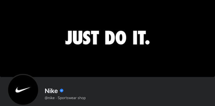
With just three words, two colors, and the classic “swoosh” logo, Nike somehow manages to encapsulate its whole brand across its cover photo and profile picture.
5. Promote Your Products and Events Through a Facebook Cover Photo
When your cover photo takes up so much space, why wouldn’t you use it to talk about the things you want to promote? Whether that’s a new product, a special offer, a big piece of content, or an event, your cover photo is a fantastic place to show it off.
For example, PlayStation uses its cover image to showcase a high-profile new release for its PS5 console. Notice how the brand combines this with a CTA urging people to play the game, effectively transforming the top half of its business page into an interactive advert.

Taking things in a different direction, Gucci’s Facebook cover photo and profile picture are given over to promoting an online event, Guccifest.

Again, the fashion brand has added some interactivity by including a scannable QR code in its cover photo. The whole image is extremely text-heavy, which isn’t what you’d expect from a brand selling a physical product, but in Gucci’s case, this just makes the cover photo even more striking.
4 Steps to Designing an Impactful Facebook Cover Photo
Now that you understand the theory behind creating a striking Facebook cover photo for your business, it’s time to make it happen for your brand. Follow this simple four-step process to turn your Facebook cover photo vision into reality.
1. Pick a Facebook Cover Photo CTA Technique That Works for You
Take another look at all those Facebook cover photo examples I included above. None of them could appear in all five sections.
The PlayStation example is really effective at promoting a product, but it arguably doesn’t pair up well with the brand’s profile picture. Nike keeps things simple, complements its brand, and matches its profile image, but doesn’t directly feature its audience or showcase a product.
Does that mean they’re all bad cover photos? Far from it. Instead, this demonstrates that your Facebook cover photo shouldn’t be all things to all people. Pick out one or two of those techniques and use them to inform your image. For instance:
- About to launch a high-profile new product? Use your cover photo to promote it.
- Got a really specific audience? Speak directly to them in your cover photo.
- Have a recognizable logo or slogan? Keep your cover photo super simple; let your branding do the talking.
2. Choose a Facebook Cover Photo Editing Tool
You don’t need to be a skilled graphic designer to create an effective Facebook cover photo. There are tons of easy-to-use, free photo editing tools that do all the hard work for you.
Arguably the most popular is Canva. It’s free to sign up and features a bunch of Facebook cover photo templates cropped to the correct dimensions. To find them, create your own Canva profile, select social media imagery, and choose the dedicated Facebook Cover option:

Just one word of caution here: While Canva is free to use, you’ll need to pay for some of the design elements.
There are lots of other options, too. If Canva isn’t working for you, try PicMonkey, Visme, Snappa, Bannersnack, or countless others.
3. Start With a Photo
Again, unless you’re a qualified graphic designer (or have access to one), you’re likely looking for the simplest possible way to create an impactful Facebook cover photo.
In that case, you definitely want to start by finding a suitable image. Something that encapsulates your brand and speaks to your audience.
Just as there are lots of brilliant graphic design tools available online, there are also tons of fantastic free stock image libraries packed with hundreds of thousands of visuals you can use to design your cover photo.
Alternatively, feel free to incorporate your existing website imagery if you’re planning to use your cover photo to showcase a product or service.
4. Remember to Use the Right Facebook Cover Photo Size
Last but not least, you must use the right dimensions for your cover photo. Otherwise, Facebook will crop or stretch it and all your hard work designing a beautiful, eye-catching image will be wasted.
So what are the right dimensions? There’s no easy answer, as frustrating as that sounds. Because 70 percent of Facebook users access the site on their phones, your cover photo has to work across both desktop and mobile. Yet cover photos display differently based on the device you’re using:
- On desktop, the cover photo displays at 820 pixels wide by 312 pixels tall
- On mobile, it displays at 640 pixels wide by 360 pixels tall
If you want to use a single image that works across both formats, Buffer recommends cropping it to 820 pixels wide by 462 pixels tall.
As an absolute minimum, Facebook says your cover photo should be 400 pixels wide and 150 pixels tall. It also advises keeping your image to less than 100 kilobytes for the fastest-possible loading.
Conclusion
Remember that your Facebook cover photo isn’t just a striking image. Choosing the right one for you isn’t necessarily about utilizing the brightest colors or the boldest copy.
It has to tie into your brand, speak to your audience, and effectively communicate your message. Ideally, anyone who knows your brand already should find it instantly recognizable.
If you’re struggling, remember the value of keeping things simple. Don’t try to be too abstract or clever. A basic image that clearly represents who you are and what you do will be much more effective than something complex that leaves people scratching their heads.
How are you using your Facebook Business Page to generate leads or sales?
The post How to Create the Best Facebook Cover Photos for Your Business appeared first on Neil Patel.
via https://AiUpNow.com November 29, 2020 at 10:17PM by Neil Patel, Khareem Sudlow,
