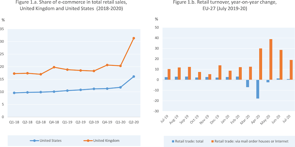
E-commerce has been gaining popularity constantly since the 2000’s. The coronavirus pandemic accentuated its evolution, influenced by social distancing, curfews and confining. Lots of existing sellers saw this as an opportunity to expand their brand online, while other people started their own online business from scratch.
The pandemic has indeed negatively affected the overall sales volume in general, but the share of E-commerce sales has increased, meaning that more and more people are inclined to buy online.

This evolution has been such that Emarketer forecasts a 16.8% increase in E-commerce sales in 2021. This increase comes after a 25.7% drop worldwide in 2020. It is therefore essential for online retailers to create elements of differentiation, whether for their potential customers, or to generate traffic by responding positively to search engine guidelines, thus impacting their SEO.
In this article, we will give you the keys to create a product sheet that optimizes your chances to convert your visitors. This will allow you to passively optimize your processes and improve your image with consumers.
Content optimization tips for your product page
Content optimization is one of the main elements influencing the success of an e-commerce site. Indeed, the generation of organic traffic allows you to obtain a continuous and passive flow of consumers to one or more pages of your online store.
The main title tag
As for an article, the title is very important on a product page. On the one hand, it allows search engines to understand the subject of your page, being the first element analyzed by the robots sent. On the other hand, it provides a first element of content to the target of your page, which will push him to click, if the title is well formulated.
To answer these 2 issues, the title must be clear. It must respond to the consumer’s request and be effective, so that he clicks. For this, a title of less than 70 characters (between 50 and 60 generally, including spaces) is recommended. The keyword must be at the beginning of the title, which offers more clarity on the nature of the product.
Speaking of the main SEO elements of your page, you should take into account the display of the SSL certificate, which is nowadays almost mandatory in order to appear in the first results on SERPs.
Favicon
The favicon is the small image displayed on the browser tab, or in the favorites bar.
Most often, sites display their logo. This shows that you are a professional, helping to create a link of trust with the consumer. Remember that trust is very important in the seller/customer relationship, and that it should be one of the main elements of your communication, including non-verbal.
Thus, each page of your site (main page, landing pages, product pages, …) must display the favicon, especially so that the visitor does not have the impression of leaving the website. Even if this should be automatically done, you must anticipate and avoid some possible bugs. This allows you not to generate navigation abandonment and lose potential sales.
Meta description
On the SERPs, the meta description represents the short text, introducing your page or providing elements of description of its content. Even if it is now automatically selected by search engines (directly in the body of the content), you can fill it in and optimize it in order to have some control over what is displayed when your product page is found.
This description of your page fulfills two roles:
- an element that pushes the user to click
- a referencing element influencing your SEO
H1 tag
Different from the title tag we talked about before, this tag represents the title of the page, displayed directly on the product page.
This H1 is then taken into account in your SEO strategy and structuring of your online store. This means that the keywords included in this title must reinforce the understanding of your pages (whether by visitors or search engines).
This title must display the main keywords of your online store and your page. Again, make sure it is not too long in order to be effective. Be sure not to exceed, once again, 70 characters, including spaces.
Content
Titles are not everything! You still have work to do. The content of your product page should also be worked on, since it helps with conversion as well as SEO.
The text must be qualitative, while including the main keywords of your product page and your site as a whole. Indeed, this text must remind the consumer what type of product/service he is on your online store for. This will help to convince them to go further, while optimizing your chances of appearing on the SERPs on specific queries.
Product description
It seems obvious, but the description is one of the main axes of optimization of your product page. Like the other elements mentioned above, it benefits both SEO and conversion.
The product description effectively overcomes the lack of use of the senses in remote commerce. The consumer can’t touch the product (for example), so the detailed description of the latter allows to push him to consume and to preview it. This can then allow him to project himself with the product and to understand how it works, pushing to conversion.
An effective description is more than 200 characters, in order to bring SEO and optimize your efforts. In this part, you can add other titles, represented by the H2, H3, … tags, which allows you to give a clear structure to your page, making it more understandable during its study by search engines.
Reinsurance elements
As mentioned above, these elements help build visitor confidence. They help to convey the following message: “you can buy on my site, it is secure”.
Several elements can be considered as reassurance elements on your site and your product page:
- contact information (phone, email address, address, etc)
- delivery information (delivery times, shipping costs, etc.)
- payment information (secure payment, types of payment accepted, etc.)
- return information (how to return the products in case of problems)
- proposed guarantees
Availability
In the world of e-commerce, there are few things as frustrating as trying to buy a product, only to find that it is no longer in stock.
The optimization of your product page is therefore also based on the indication of this information. This helps to avoid the frustration generated by disappointment and loss of time for the consumer.
Frequently Asked Questions
Also known as FAQ, it helps to alleviate requests to your customer service, or your mailbox, if not. It also influences the consumer’s confidence in your online store.
In addition to that, it represents a good part of the content of your product page and your site. It can therefore benefit your SEO, thanks to what is called User Generated Content (UGC). This allows you to generate content passively, thanks to the questions of your visitors and customers, thus feeding your SEO strategy.
Netlinking
This advice is also valid for your entire site. Each page of your online store, including your product page, must redirect to other pages. These links create semantic cocoons around your content and help you generate some logic.
Moreover, pages to which no link redirects are considered orphaned, which is a very bad sign for search engines.
Form optimization tips for your product page
Content on your product page is meant to be optimized, but not only. A visually attractive or interesting webpage will bring you more conversions, especially when applying the following tips.
Pictures
Images are a central element of the product page. We talked about this when we discussed the description: the consumer must see himself using the product.
Images are used to provide more information about the product, while stimulating the consumer’s senses, which will attract more attention. The pictures of your product must be very qualitative. This effectively allows for more effective information intake from the consumer, potentially increasing your conversion rate.
Today, many online sellers use 360° visuals, allowing to preview the product from every angle. This feature works particularly well if you offer a detailed product description. In some industries, sellers go as far as offering 3D renderings of their products, further optimizing the information intake.
Finally, images are considered rich content by search engines. Like your written content, they have a tagging system that allows these engines to understand the image without seeing it. This is done through the title and alt tags of the image. To do this: name the image well with important keywords (like the product name) and do the same for the alt tag.
Videos
Videos are also very popular with consumers. Like 360° images, they allow to preview a product in detail. On top of that, the video allows to show how to use the product, again serving to potentially de-fleet customer service requests.
In addition, video is a great way to get consumers’ attention, since it uses not only sight, but also hearing.
Retailers have various uses for video, including highlighting user feedback, reassuring the consumer and highlighting the benefits of the product.
Video is also a very good means of communication, since it allows the consumer to be immersed in your universe, making your company and your products recognizable. It is a non-negligible element of differentiation.
Ergonomics
As with your entire online store, you must take into account the ergonomics and user experience (UX). This fulfills two main objectives, which are:
- Your conversion rate: users will be more inclined to consume on a site with good usability. This allows you to convey a sense of professionalism, reinforcing the trust given to your online store
- Your SEO: search engines pay more and more attention to the user experience on websites, which is then taken into account in the way they rank your website
Caution! Ergonomics must be optimized on all devices. Indeed, search engines are not content to analyze your site on a computer. Mobile sites are more and more highlighted on SERPs. This is due to the popularity of smartphones and an increasingly powerful network.
About the price: it may seem logical, but the price must appear above the fold (below it, the content does not appear). This allows the consumer to have the information as soon as he arrives on the product page, saving time and avoiding frustration. This is also true for any important element the visitor has to know before buying the product.
Finally, think about the convenience of navigation. Present a clear structure, with understandable categories and a breadcrumb trail. This helps the consumer to know where he is on your site.
Call-to-actions
CTAs help you get a reaction from the consumer. These buttons are often more colorful than the rest of your site, pushing for a click.
You can place several of them, but not too many. You must focus on the essential and avoid losing the visitor. Prioritize certain areas, such as the purchase button, or certain information buttons (payment, delivery, return, …).
On a product page, an effective CTA is contrasted and no element will hinder the click. You can go as far as making this CTA sticky, which allows it to appear on the entire page. Indeed, a CTA that is not sticky will not be displayed if the visitor scrolls.
Feedbacks
Feedbacks were discussed in the section on video, but it is also important to have them on the page. First of all, they allow you to show your visitors that customers exist, and therefore that people have already bought your products.
Moreover, feedbacks push the visitor to consumption. If they are positive, feedbacks placed on a product page actually help to convince the visitor more easily. Be careful! Don’t hide bad reviews. It happens that people are not satisfied with their purchase, it is not a disaster. Rather than hiding these comments, try to understand why they were made. This will allow you, on the one hand, to correct your offer and, on the other hand, to humanize your company to the visitors.
Finally, like the FAQ, feedbacks are taken into account by search engines. The lexical field used in these comments therefore influences your SEO.
Social media
We can’t really talk about E-commerce without talking about social networks. This is also true for the product page.
It is indeed possible to add sharing buttons to social networks. This allows you to include the consumer in the communication of your company, and to make him an influencer to increase word of mouth.
This represents an opportunity to reach more consumers corresponding to your target, since they are part of a customer’s entourage.
How to build the perfect product page?
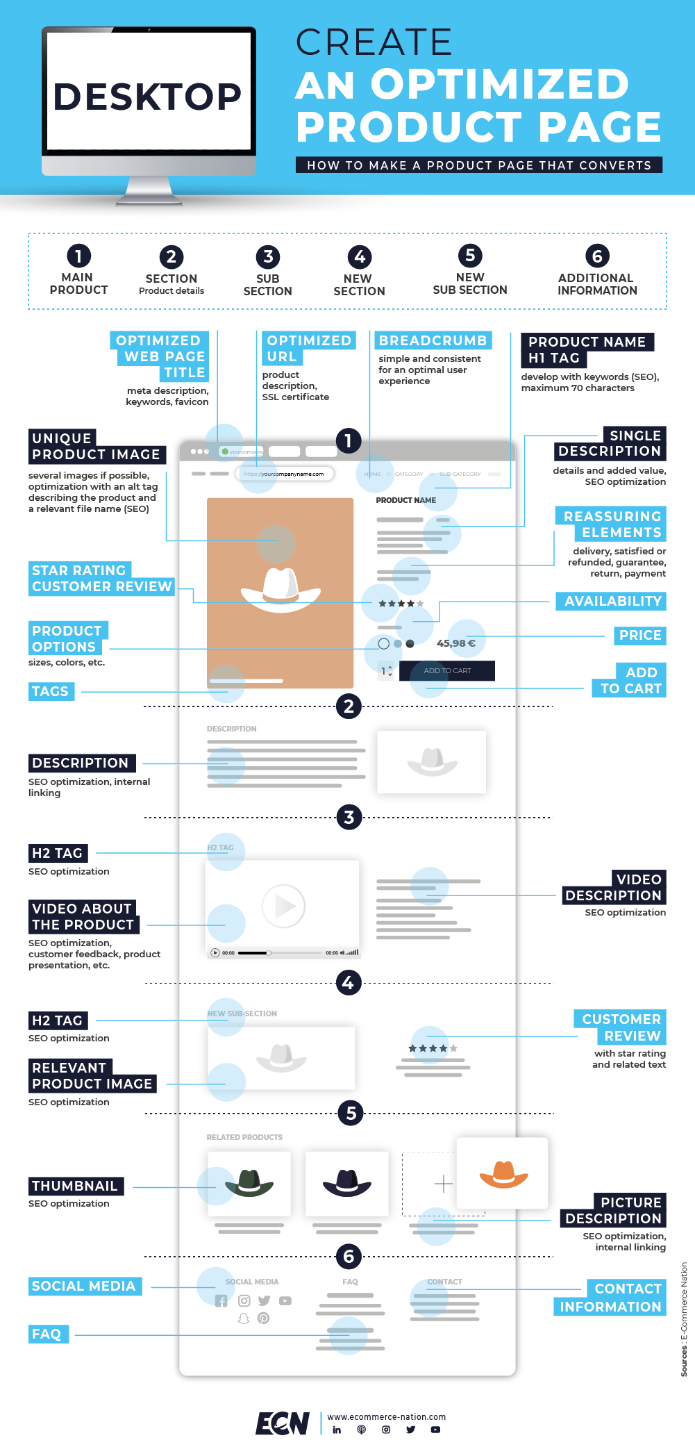
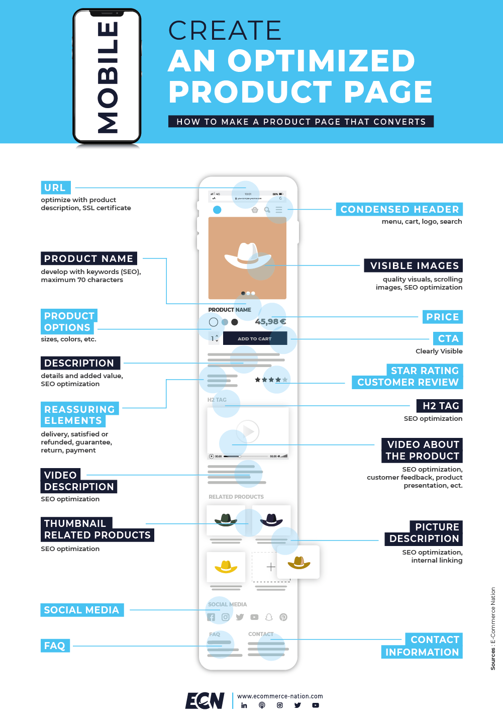
All the elements discussed in this article are applicable on Shopify, and on many other CMS. In order to condense all this information, we offer you an infographic.
Feel free to share it and your product page building experiences on our social networks!
Build the perfect product page on desktop

Build the perfect product page on mobile

via https://www.aiupnow.com
Thibault Herpin, Khareem Sudlow
