At Groove, we work with several eCommerce platforms, and Shopify is one of the most versatile and easy-to-use options to start selling. As of February 2024, there are more than 4.5 million Shopify stores online. This means there are plenty of Shopify website examples you can browse to get ideas and learn best practices.
The question is, how do you know which Shopify store examples you can browse to learn best practices for how to design your own store? Below, we dive into some of our favorite eCommerce websites. Let's check out this list of Shopify website examples.
1. Allbirds
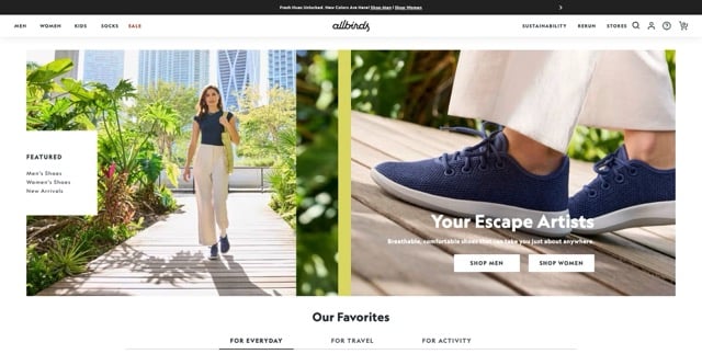
Allbirds is a company whose primary product is shoes. With an unmatched commitment to comfort and sustainability, the company brings its mission into nearly every part of its Shopify store.
Studies show that 80% of customers place a high value on sustainability. On almost every page, Allbirds puts a strong focus on sustainability. Equally important, the models in the company's lifestyle photos fit its target market.
2. Uppercase Magazine
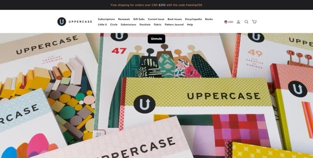
The Shopify store for Uppercase Magazine features engaging videos, colorful images, and messages directly from the publisher's founder. This publisher is unique because it only offers an ad-free print version of its magazine.
Every section of the Shopify store emphasizes that the company is supported by subscribers, not advertisements. The store invites readers to connect with the brand in several different ways, making this one of the best Shopify website examples for sellers who offer only a few products.
3. Meow Meow Tweet
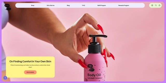
The founders of Meow Meow Tweet offer unique soap products, and their Shopify store is just as unique as the products. When they built the company, the founders were inspired by their cats, and drawings of their pets grace the product images. Colorful images cover the homepage, and an attention-getting video is just below the fold.
4. Velasca
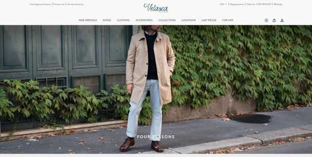
As a premier seller of men's shoes and clothing, Velasca has an international clientele. The website's designers kept this in mind when designing the Shopify store. Customers can chat directly in WhatsApp via a convenient one-click access button located directly beside the shopping cart and account icons. Equally important, the main menu links to Velasca Women, the company's companion website for women's clothing, shoes, and accessories.
One of the primary features that make the Velasca website one of the most unique Shopify website examples is the accessibility options. Right beside the shopping cart and account icons, there is an accessibility icon that offers online shoppers every option imaginable to make for a more accessible shopping experience. Shoppers can adjust text size, hide images, fine-tune brightness and contrast, stop animations, increase saturation, and even opt for dyslexic fonts.
5. Adored Vintage
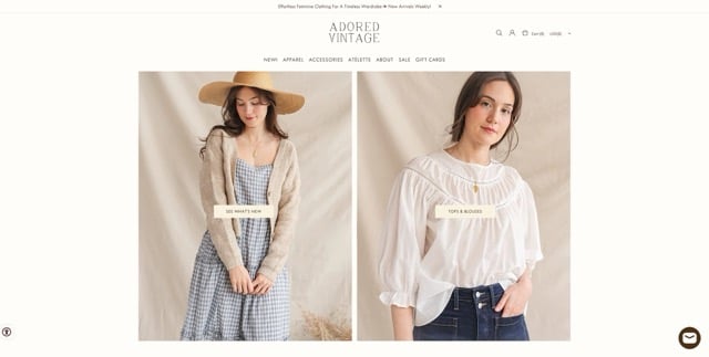
The Adored Vintage apparel and accessory offerings are inspired by the charm of pastoral landscapes, flowers, history, and art. This theme is beautifully reflected in the company's Shopify store, which features vintage-style images and fonts. Shopify website examples in this style are challenging because it's easy to overdo the subtle elements that make this type of store so unique. Adored Vintage displays the perfect balance between form and function.
An integral part of Adored Vintage is its community of customers. User-generated content (UGC) graces the front page, showing the store's garments being worn by real people instead of models. This Shopify store feels like a virtual escape to a romantic European countryside.
6. Verve Coffee Roasters
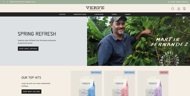
The Verve Coffee Roasters Shopify store invites its visitors to "upgrade your coffee routine." Verve offers a popular subscription coffee service, which is an excellent way to increase revenue while also meeting the customers' needs. And the happiness of the customers is featured front and center, with reviews shown on the homepage. The site's about section is titled "Story," and this page shares an intimate picture of what Verve is all about using multimedia.
The Verve website features stylish photography paired with evocative language. Both of these things keep customers on the page longer. The coffee packaging is minimalist, with subtle splashes of color. This theme carries over into the website's imagery with black-and-white photos and graphics. Below the fold, users find an interactive quiz that helps them select their ideal blend.
7. Satya Organic
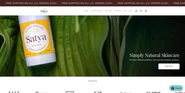
The Satya Organic designers placed a lot of emphasis on visual branding when building the company's website. This is apparent from the signals and earthy tones that let customers know they're in the right place if they want plant-based goods. The Indigenous Canadian woman who created Satya has been featured in several publications, and they're all listed in a moving banner just below the header image.
The Satya Shopify store is also one of the best Shopify website examples for sellers who place a high value on ethics. Right above the website's footer, a large banner clearly lists the benefits of the products, along with certifications such as cruelty-free, carbon-neutral, steroid-free, plastic-neutral, USDA organic, and fragrance-free.
8. Healthy Roots Dolls
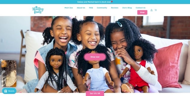
Healthy Roots Dolls is a company that makes storybooks and dolls that represent diversity and empower young girls. The company's founder notes that while 65% of the population of the world has curly hair, only 40% of women like their curls. The founder believes that toys impact how people think, and having dolls that look like them has a positive impact on a girl's self-esteem.
This store sells products for kids, and the bright colors and playful fonts reflect that. Store owners who sell culturally sensitive products will find this site to be one of the best Shopify website examples. Customer testimonials and educational materials are found all over the site. Also, the owner's credentials as an art major are featured prominently in the online store.
9. Suta
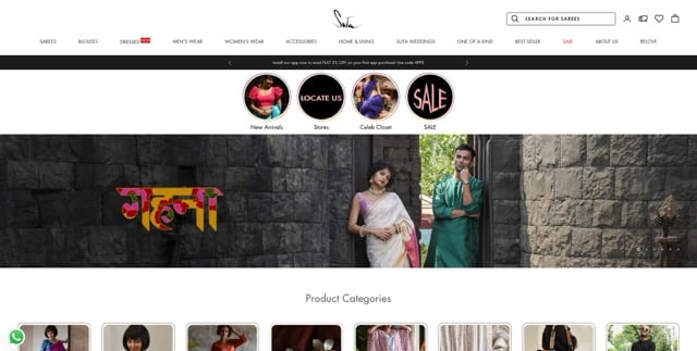
Suta is a fashion house founded by two sisters who live in Mumbai, India. The company places a huge focus on its dedication to employing artisans and weavers from disempowered communities. The unique handmade fabrics are sustainable and feature classic saree silhouettes, blouses, and dresses. Not every Shopify store has a blog, but Suta's blog is an important part of the company. Recent blog posts are featured on the homepage, with a link to read all articles.
Color plays a big role in Indian culture, and the Shopify store reflects that with splashes of color throughout. The main menu elegantly organizes product lines, with special sections for weddings, home and living, best sellers, new arrivals, and more. This company has been featured in many publications both in India and around the world. Featuring the names of the media companies lends credibility to the site.
10. Cowboy
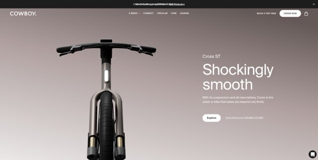
Cowboy prides itself on being the go-to shop for smart e-bikes. On the Shopify store's homepage and throughout the site, shoppers find high-resolution photos and videos that show the bikes in motion. The Cowboy Shopify store is one of the best Shopify store examples for minimalist design. This eCommerce store is all about the product, and you won't find fluff here.
On the site, there's a place where shoppers can book a test ride so they can try out the smart bikes for themselves before buying. In terms of Shopify website examples for products with a high price point, giving customers the option to try before they buy is a unique selling proposition.
11. Pot Gang
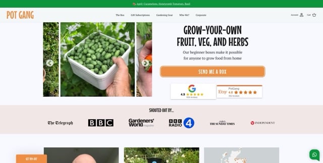
Many online sellers of seeds and plants struggle to offer an engaging user experience. These nurseries and sellers have a huge range of products, and featuring them individually can be overwhelming. Pot Gang has found the perfect juxtaposition of visual appeal and function. The fonts used are fun and lively, and the store has plenty of white space, so their photos stand out.
The site is graced with vividly-colored imagery and smiling, delighted customers. Pot Gang makes strong use of user-generated content, with photos featuring people of all ages and their budding or blooming plants. And the customers are certainly happy. Their reviews are shown in a carousel right below the fold.
12. Kirrin Finch
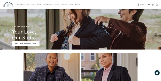
The goal at Kirrin Finch is to challenge the rigid norms of the fashion industry and focus on creating menswear and womenswear that make customers feel confident and comfortable in who they are. The fashion at Kirrin Finch is gender-defying, and the company was created by a couple who were frustrated trying to find clothing in the styles they loved.
Social engagement is important to the company, and its Instagram account is prominently featured above the footer. Photos show cheerful people wearing the company's stylish and fitted apparel. The site itself has a minimal feel, with all of the attention going to the striking products.
13. Beefcake Swimwear
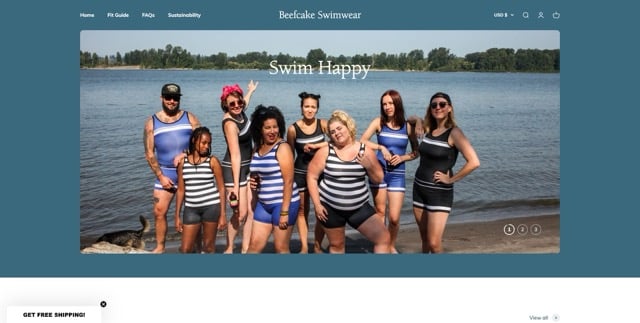
When crafting her eCommerce store, owner Mel Wells took her time. After more than two years, Beefcake Swimwear launched. The store features androgynous, thoughtfully produced swimwear for people of all sizes. Size inclusion is key to the company's products, and the models in the photos are proof of that.
Rather than using staged studio photos, Beefcake Swimwear styles its products being worn at outdoor swimming venues. While the photos are professionally taken, they have the vibe and feel of casual photos taken by customers. The main image photos show just the swimwear, but also make use of interactive hover reveals to show a model playfully posing while wearing the suit.
14. Camille Brinch
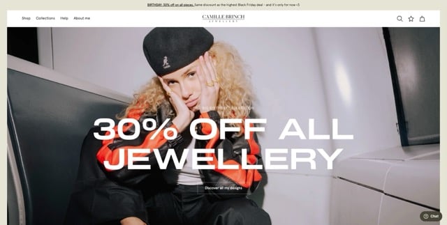
The Camille Brinch website is as elegant as the jewelry sold there. With carefully designed font pairings and muted colors, this site makes customers feel they've stepped into an exclusive boutique. Neutral colors add to the elegance.
Camille's eCommerce store is one of the friendliest Shopify website examples in terms of helping site visitors learn more about the founder's story, the process, and the brand. The owner describes her products using the first-person narrative, so it feels like you're having a conversation with her. The site features video content and large lifestyle images that are appealing to anyone who visits it.
15. GOODEE
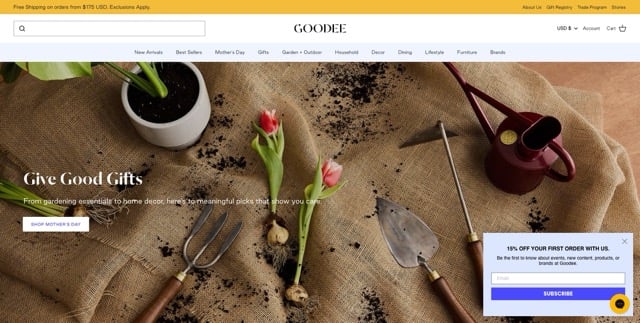
Twin brothers Dexter and Byron Peart created GOODEE. The fashion industry alums used their knowledge of building a global brand and working a supply chain to transition to home decor sales.
GOODEE works with global independent artisans, and the company places a lot of emphasis on ethical practices and fair trade policies. The website features prominent stories of the artists who create the company's wares, highlighting each piece's uniqueness.
A Final Word on Shopify Website Examples
We can't overstate the importance of eye-catching web design when you're designing your Shopify store. When making decisions about the design of your Shopify store, keep your business goals in mind. Now that you've checked out some of the best Shopify website examples, which one inspired you the most? Take the next step to transform your store by getting in touch with a Groove specialist today for a personalized Shopify store consultation.
via https://www.aiupnow.com
spencer@groovecommerce.com (Spencer Flaherty), Khareem Sudlow
